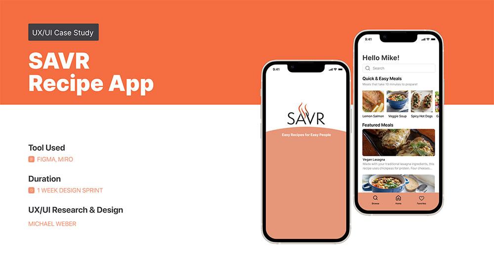
by Michael Weber
PROJECT OVERVIEW
SAVR is a mobile recipe app with a library of recipes and cooking tips for people who love to cook.
However, their recipes have been receiving negative reviews when it came to confusing steps and advanced techniques. People have felt disappointed with their recipe outcomes because they thought the instructions were not clear or easy to execute. Users also complained using their mobile device was difficult when cooking with messy hands and having to scroll for additional directions.
My Role:
UX Designer, UI Designer,
User Tester & Interviewer
(solo student project)
Modified GV Design Sprint,
5 days; Designed in Figma for iOS
User Mapping, Ideating, Sketching, UX Design, UI Design, Prototyping, Usability Testing
PROJECT DURATION:


THE PROBLEM
In the app, SAVR recipes are confusing, frustrating and difficult for user to follow.
THE GOAL:
Improve users’ ability to follow recipes.
How might we help users better understand the SAVR recipes, preparation and the cooking process?
PROPOSED SOLUTION:
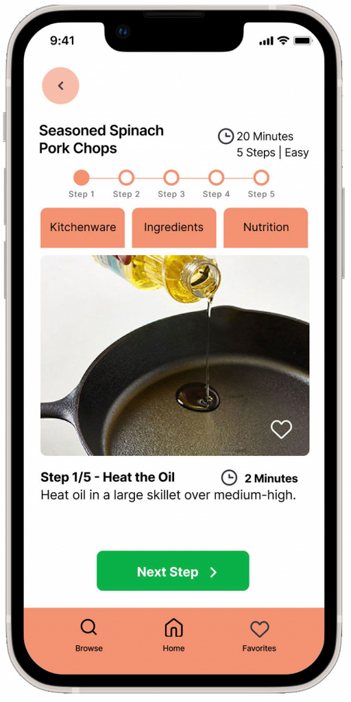
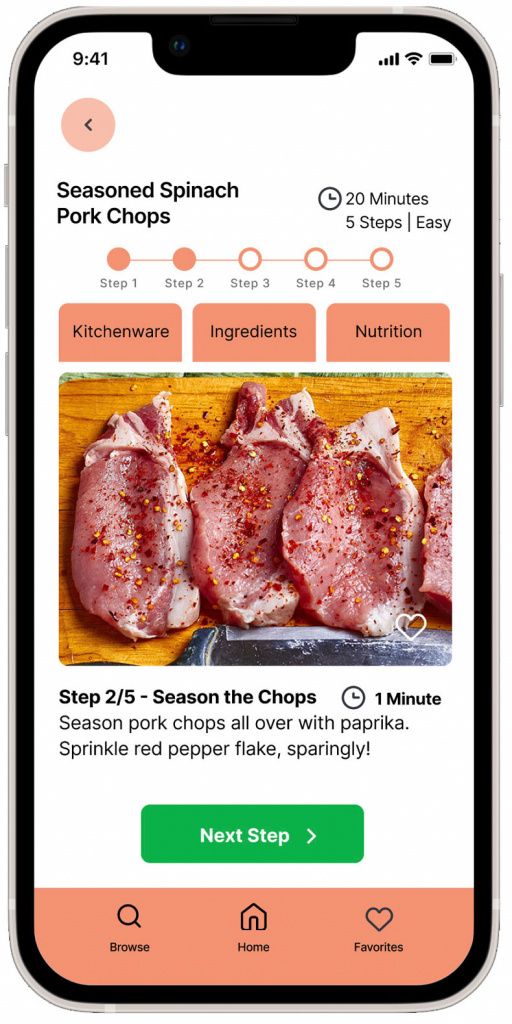
• Use photos throughout each step of the process
• Communicate the time for each step
• Use a page for each step of the process that eliminates scrolling with unclean hands
• Re-write the recipe copy to fit each step on each page
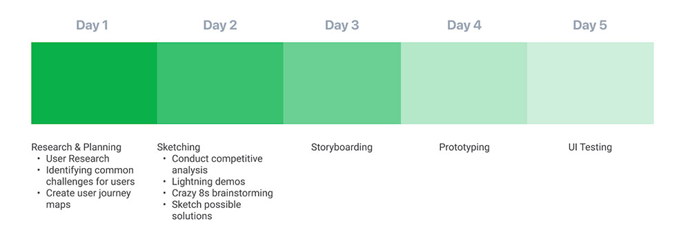
DAY 1
UNDERSTANDING & MAPPING
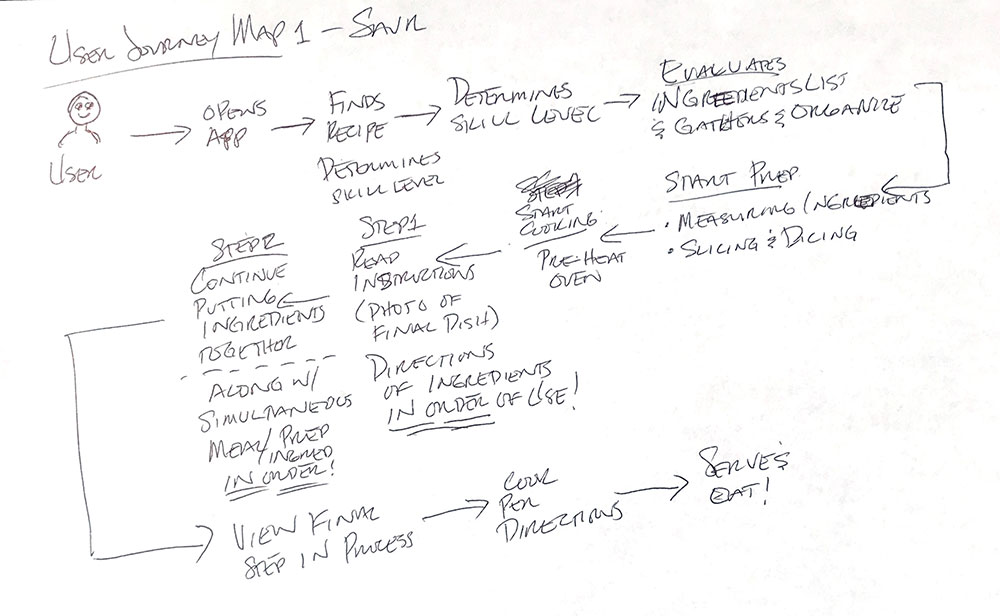
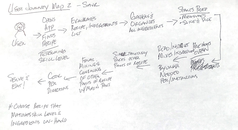
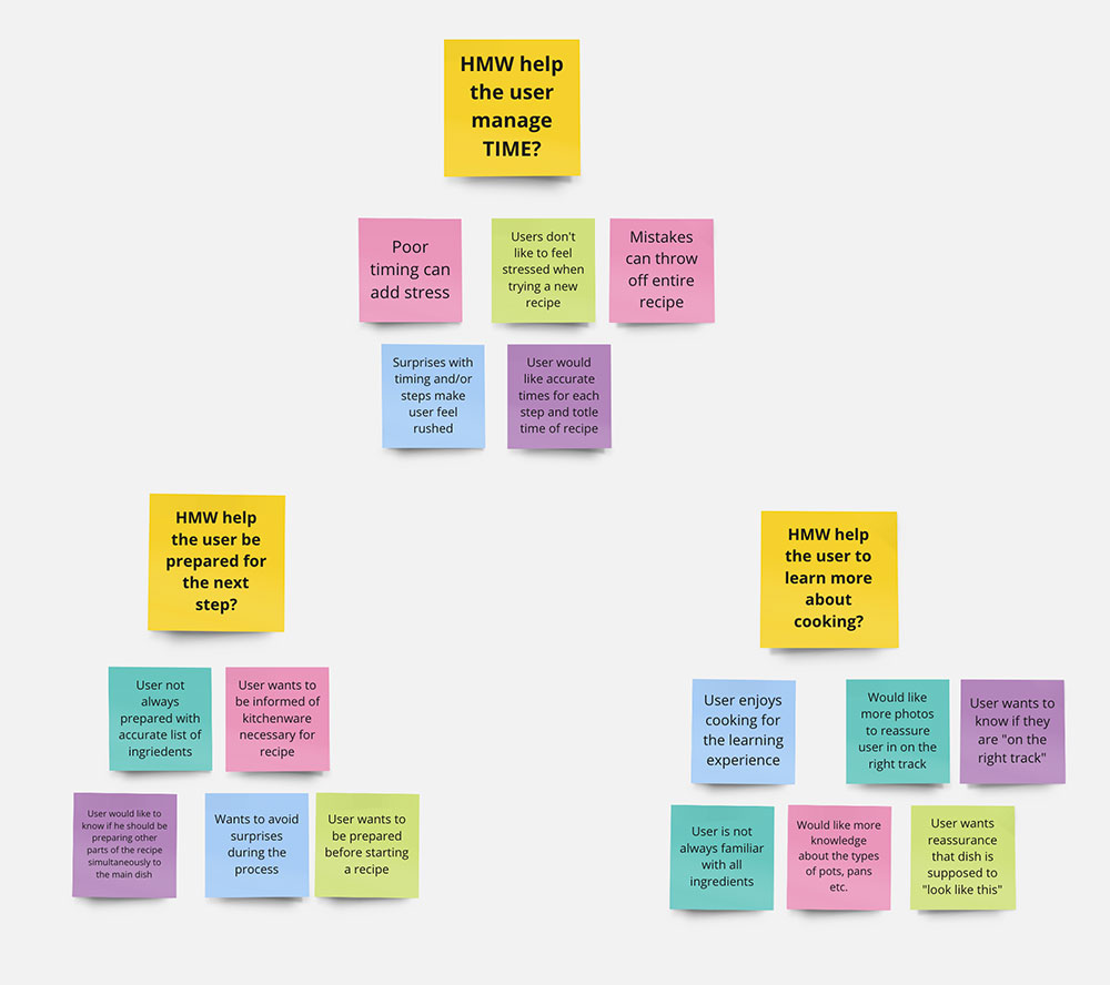
Identifying important pain points guided my approach to ideating solutions throughout this sprint, starting with creating journey maps of the user’s cooking process.
A couple of rough sketch’s of journey maps allowed me to visualize the processes to keep in mind when designing and how a user moves through the recipe screens.
Journey Maps:
USER RESEARCH
• Users are confused and frustrated during steps in the cooking process as there are no visuals for them to compare their progress too.
• Time required was often inaccurate or vague for both preparation and cooking time.
• While cooking, users have to scroll on their device so they have to wash their hands to check the next step of the recipe.
• Recipe steps are not simple, clear or logical.
• Photos or video is needed to show the user how each step should look.
Affinity Map:
DAY 2
COMPETITOR ANALYSIS & IDEATION
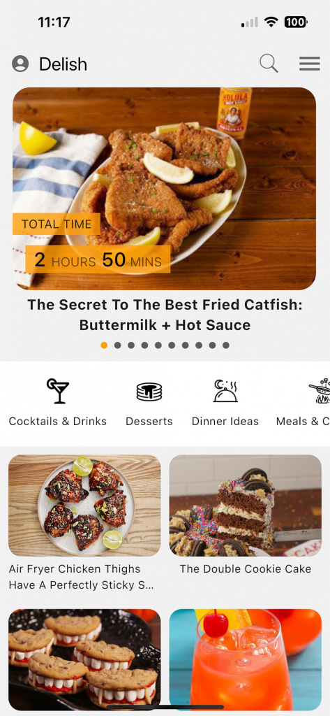
I analyzed 4 apps based on searches and reviews:
• Whisk
• Mealime
• Supercook
• Delish
One app was a meal plan app and another app uses what ingredients you have in you cabinet to create a meal for the user. But the rest of the apps were recipe apps. When studying these apps, I found the following common design traits that helped users:
• Times for prepping and cooking were clearly stated
• Ingredients for each recipe were clearly listed
• Photos and/or videos are used to guide the users
• The apps provided the user with individual, easy-to-follow steps
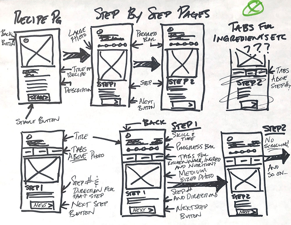
SKETCHING & CRAZY 8s
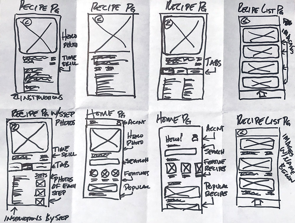
A small sample of my sketches and a Crazy 8 sketch. I used UI elements that would help users see their progress, make the step-by-step process easier and for educating the user on different types of kitchenware.
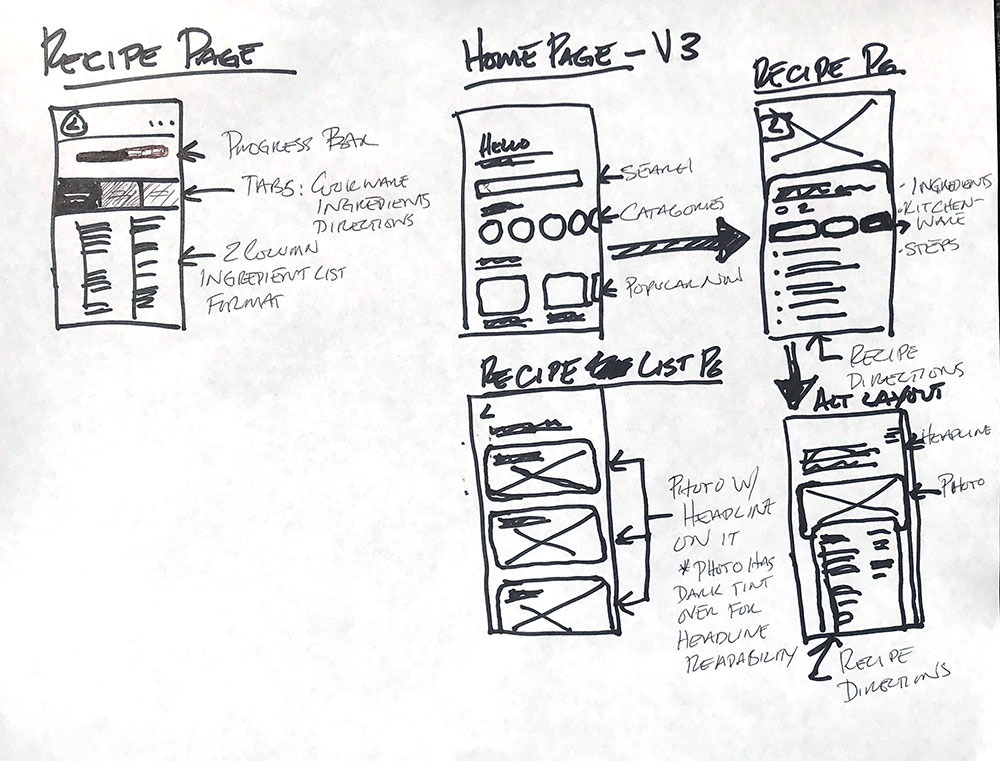
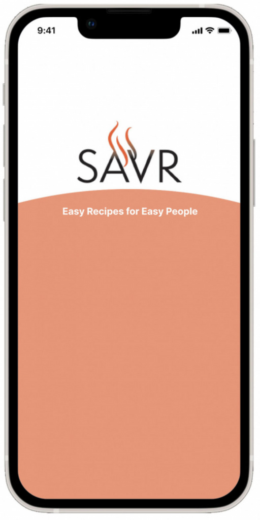
LOGO DESIGN
A logo was designed for the SAVR app to convey to the user “savory recipes”. And what a better way to do that than with smoke/steam/flames streaming off the the word, “SAVR”.
DAY 3
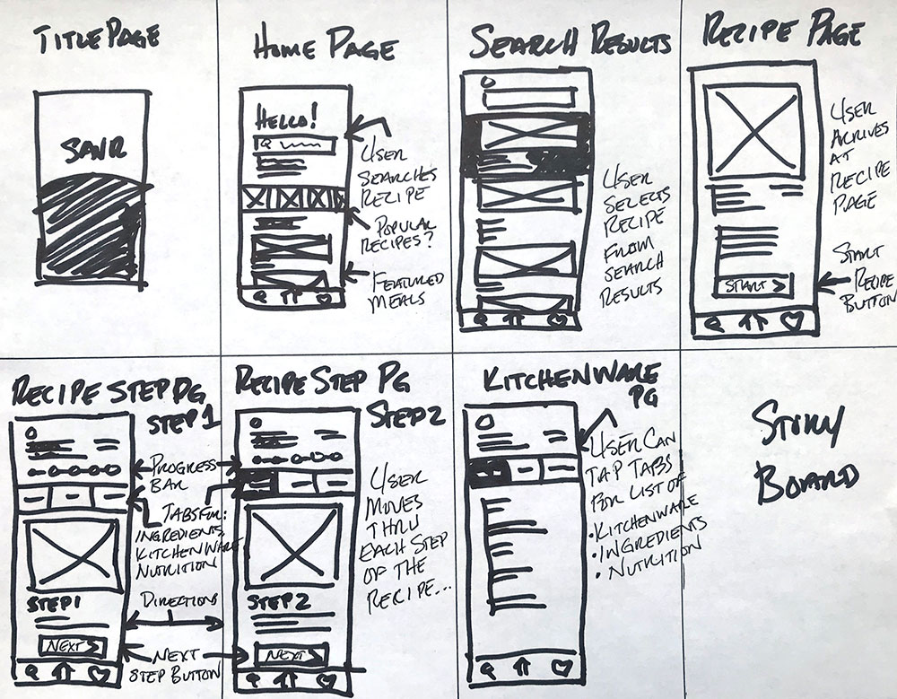
STORYBOARD
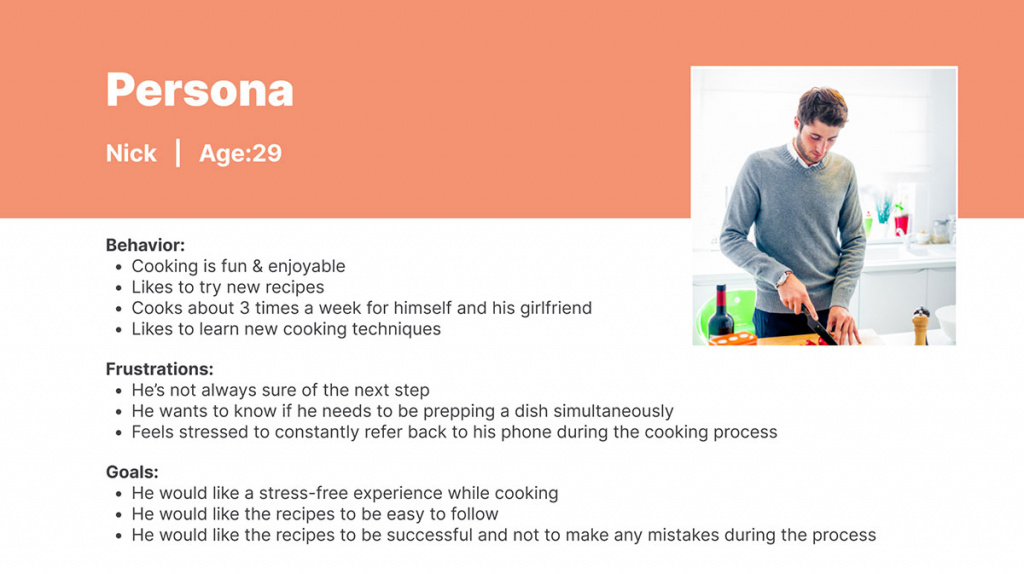
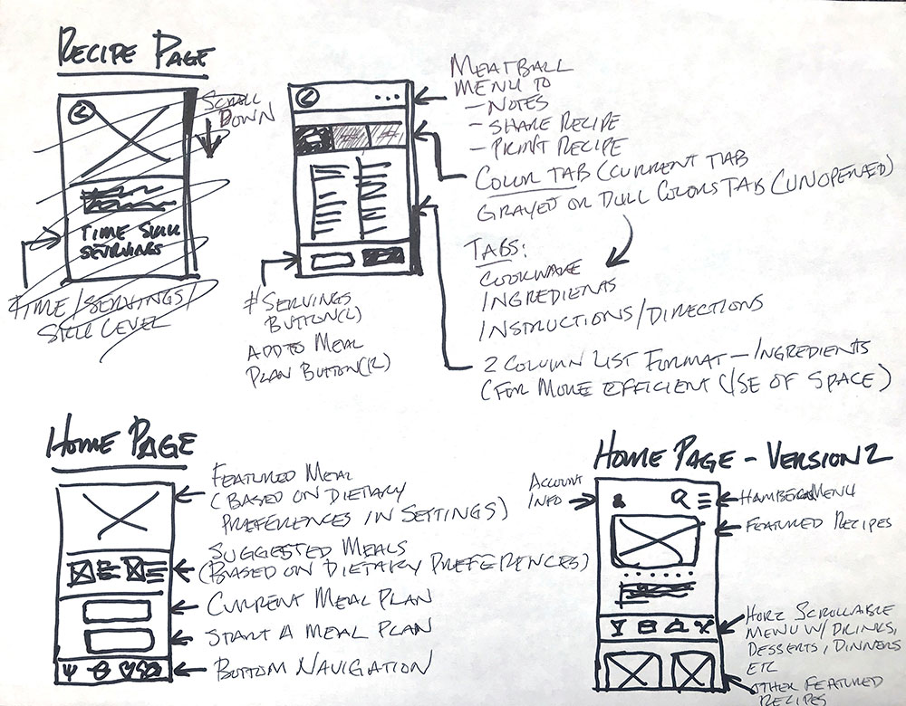
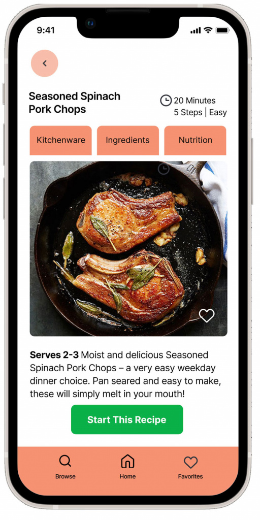
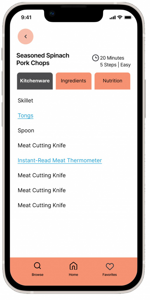
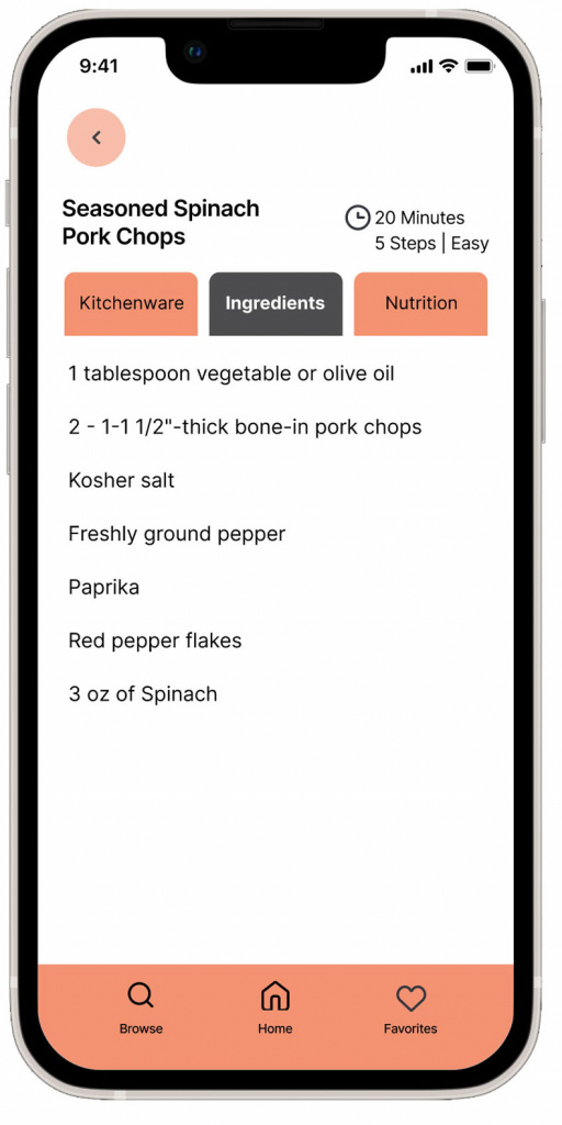
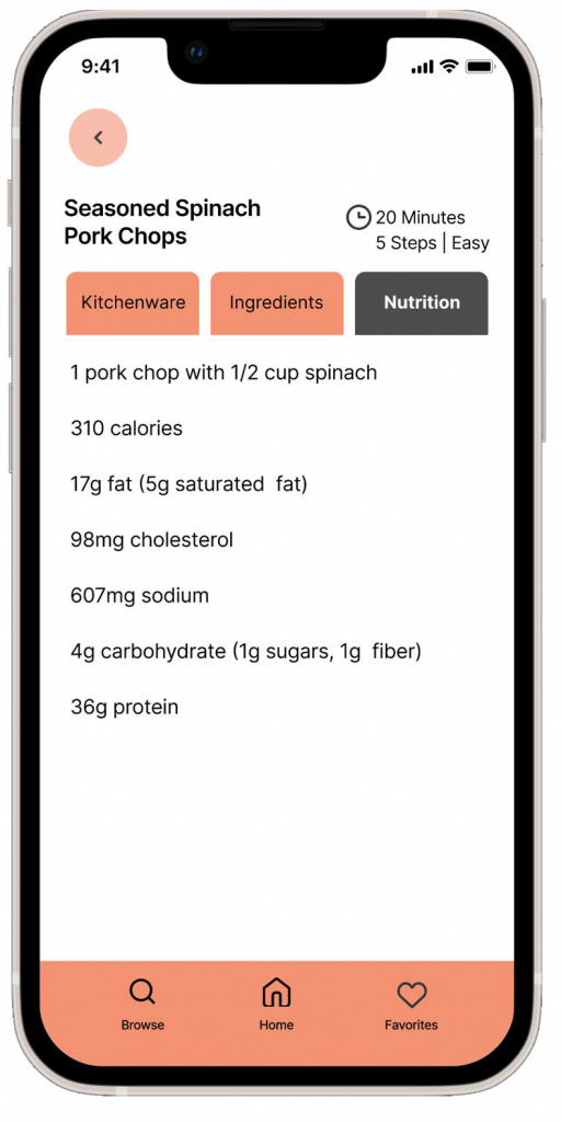
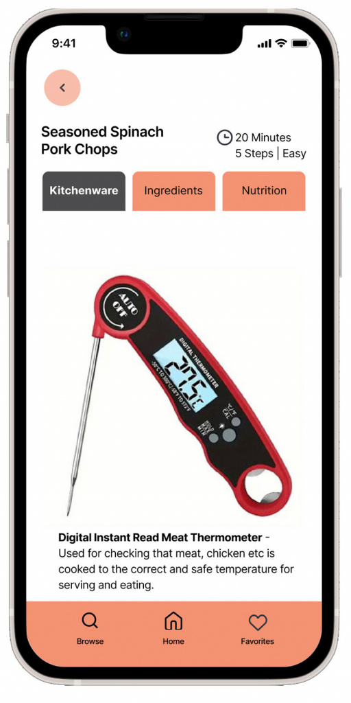
After creating several sketches, I developed a storyboard based on my research, focusing on creating a seamless user experience within the app. The goal was to make it easy for users to search for a recipe and start cooking right away. Informational tabs such as “Kitchenware,” “Ingredients,” and “Nutrition” were included to enhance the user’s cooking knowledge and provide necessary details for a healthy cooking experience.
DAY 4
PROTOTYPING
Design Sprint Time Constraints
Using my ideation sketches and storyboard, I created 1 route with only 1 recipe available to view.
The route consists of:
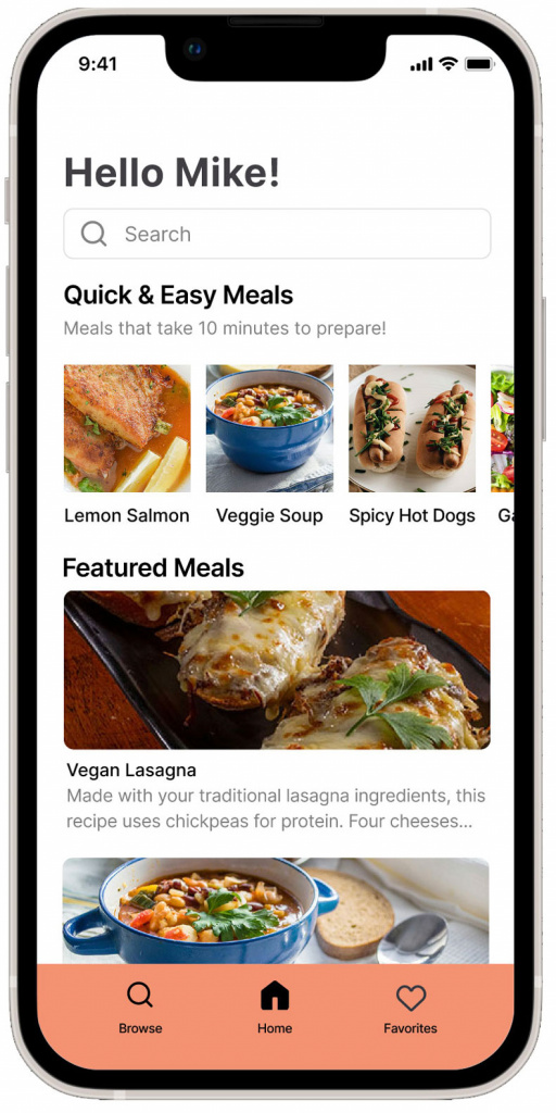
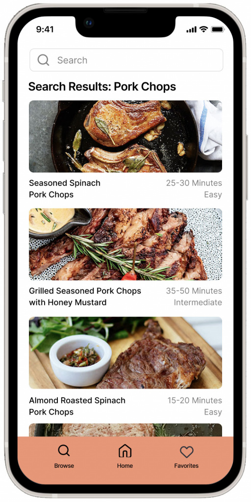
1. The Home page
2. Searching for a recipe
3. And, selecting the first pork chop recipe at the top of the list
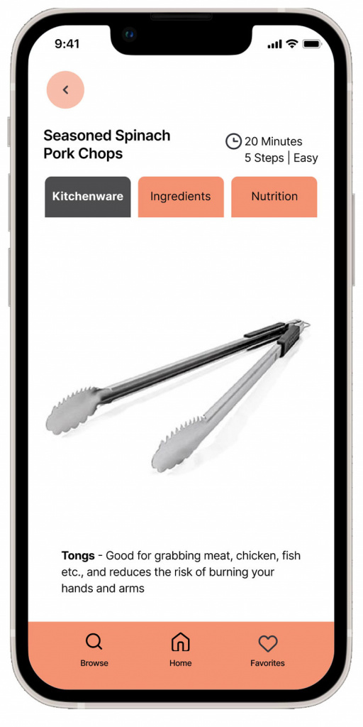
From there, the user can move through the recipe step-by-step pages and view the kitchenware, ingredients and nutrition pages. The user can even select the blue underlined text in the Kitchenware list
page to learn about 2 tools for cooking this recipe.
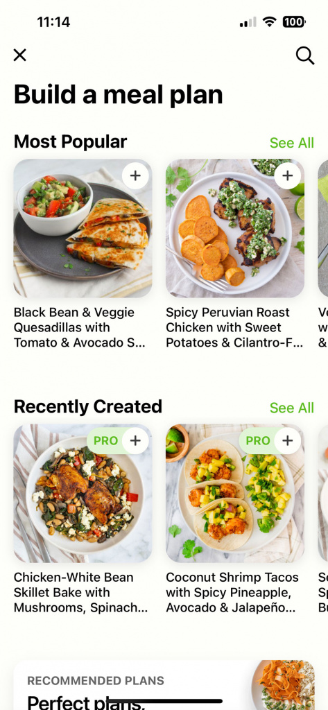
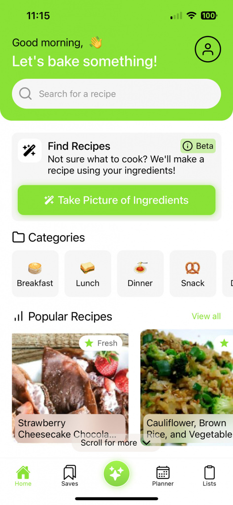
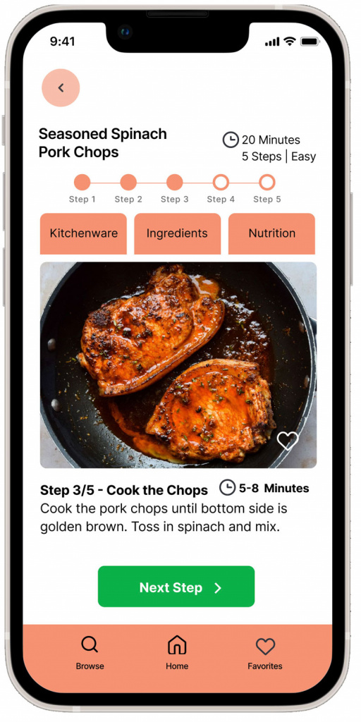
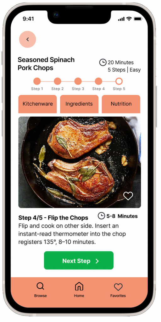
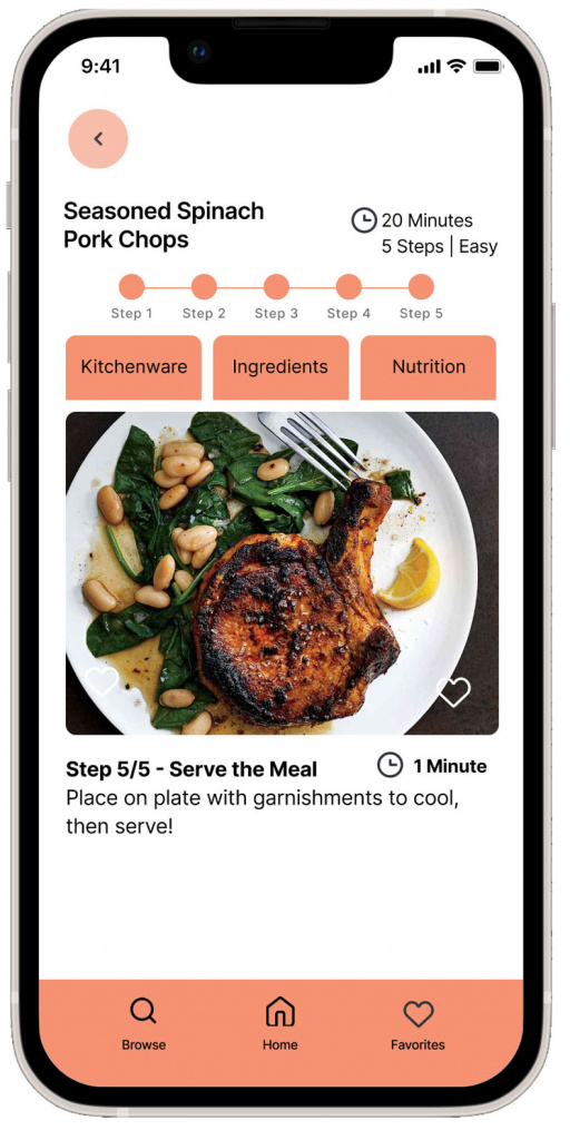
Below are the hi-fidelity screens for the SAVR App.
Prototype Link (Click the logo):
DAY 5
VALIDATING THE SOLUTION
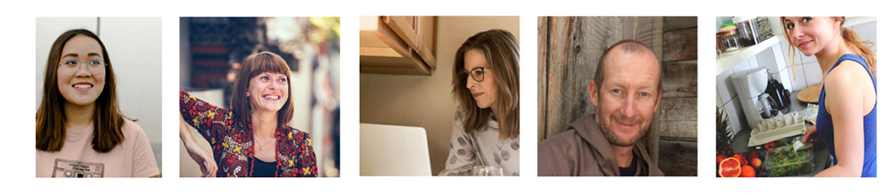
I conducted usability tests with 5 participants; 4 in-person and 1 remote. Users feedback validated that the flow and features were useful and helpful for their cooking experience.
Users said the recipe process was “easy to follow”.
Users commented that they liked the shorter written steps. One test participant said that they believe they would feel less stressed while cooking as a result. When I mentioned to the participants after the test, that there was no scrolling in the prototype, they were surprised they hadn’t noticed it. But mentioned that was a great feature!I conducted usability tests with 5 participants; 4 in-person and 1 remote. Users feedback validated that the flow and features were useful and helpful for their cooking experience.
Users appreciated the time and progress bar information.
Many users said they liked seeing how much time different parts of the recipes would take. Users thought it was good to know how many steps there were left or to expect in the recipe.
“The photos are informative & helpful.”
Users liked photos throughout every step of the process. They found it reassuring and gave them the confidence that they were on the right track.
“I love how the app is geared towards various skill levels.”
Users commented that they liked the tabs and links that educates the user on different tools. One user suggested that there be a purchase option in the tab where they are learning about a specific kitchenware tool.
“I like the look of the app. It’s pleasing and calming to me.”
Users commented that they liked the “calm colors” and that they are “easy on the eyes”.
CASE STUDY CONCLUSION
The SAVR app had been receiving negative reviews when it came to confusing steps and advanced techniques. People felt disappointed with their recipe outcomes the instructions were not clear or easy to execute. Users also complained using their mobile device was difficult when cooking with messy hands and having to scroll for additional directions.
Successful solutions were designed and applied into the app:
• I used photos throughout each step of the recipe process.
• Time was labeled to communicate the time for each step in the recipe.
• I used a page for each step of the preparation process that eliminated scrolling with unclean hands.
• I re-wrote the recipe copy to fit each step on each page.