by Michael Weber
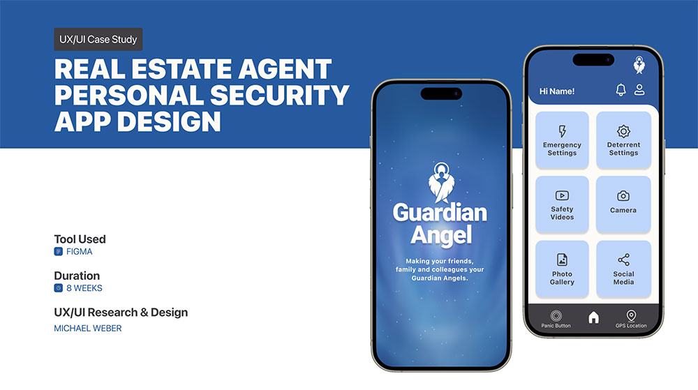
PROJECT OVERVIEW
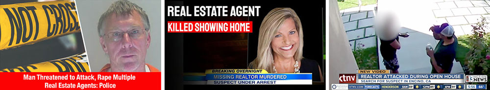
Real Estate Agents work directly with the public and while most client meetings are professional and uneventful, at times they have been the victims of assaults, kidnapping, rape and worse.
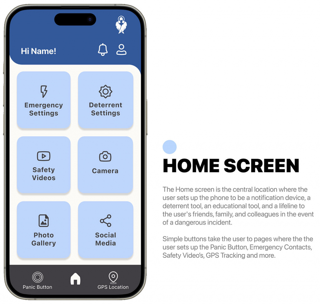
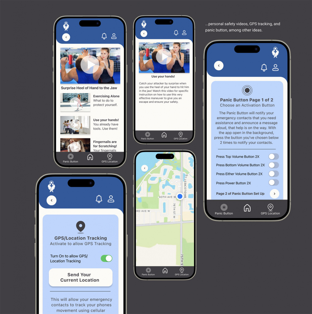
Guardian Angel is an app that makes your cell phone a notification device, a deterrent tool, an educational tool, and a lifeline because it notifies by text or live phone call the user’s friends, family, and colleagues in the event of a dangerous incident thereby making them their guardian angels! Additionally it educates the user on personal safety that could deter an attack. In the event of an incident, the user can be tracked by GPS by the user’s “guardian angels” and call 911 by using a panic button.
PROBLEM STATEMENT
Crimes have been increasing over the past couple decades against
real estate professionals.


How might we help Real Estate Agents be empowered with their security?
EMPATHIZE & DEFINE
RESEARCH PLAN
Background on the Project: How might we help Realtors be safer when showing property and possibly deter a physical attack against the Realtor once it begins.
Objective: Gather insights and feedback from potential users for an app that provides safety features that could deter or stop a physical attack.
Possible Research Questions:
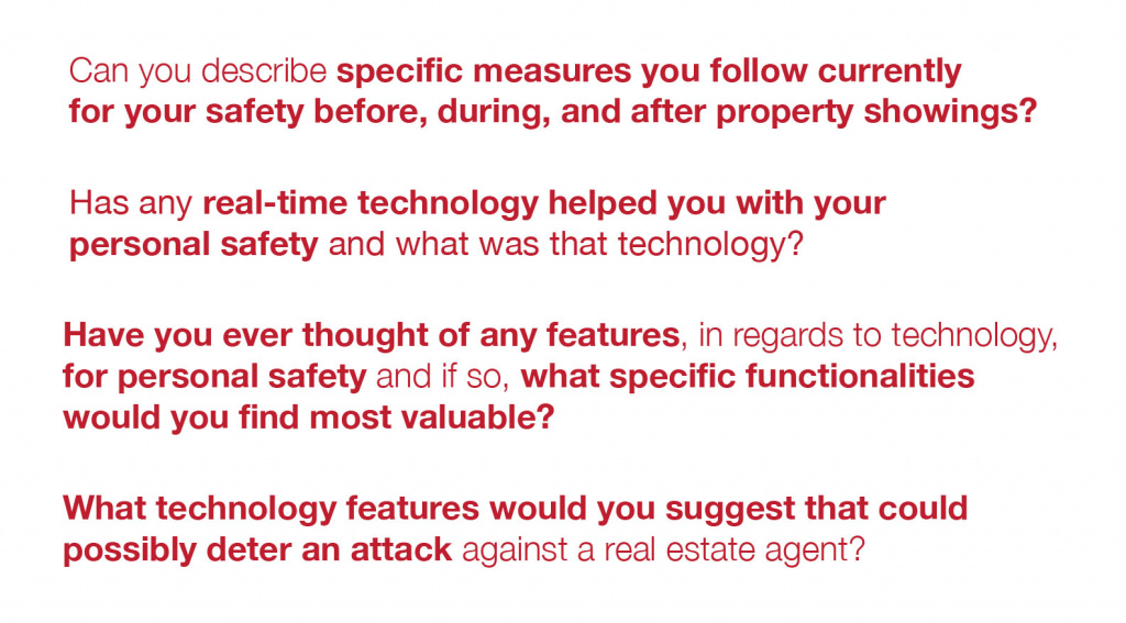
1. How do you currently determine if a property is safe for a showing to potential clients?
2. Can you describe any specific measures you currently follow for your personal safety before, during, and after property showings?
3. Have you ever wanted or needed real-time communication assistance features in an app for safety concerns while showing properties to clients? If so, what specific functionalities would you find most valuable?
4. What app features would you suggest that could possibly deter a physical attack?
Methodologies:
• Conduct user surveys to assess real estate agent experiences followed by real estate agent interviews to do a “deep dive” to understand experiences and behavior before, during, and after a property showing.
• Using the information from the interviews, create usability testing with Low- and High-Fidelity prototypes.
Participant Characteristics:
• Realtors aged 21-65+
• Use cell phone apps regularly and owns a smartphone
• Realtors who regularly show properties to potential clients
Recruiting Methods:
• Ask if Realtor participants are interested in an interview on the survey
• Ask Realtors I currently know if they will participate
SECONDARY RESEARCH
(A Summary of the research)
Secondary research was conducted and revealed Real Estate agents, when showing a home or private property, have safety concerns when they are alone with the client.
Real Estate agents work in an environment meeting all types of people through property showings, open houses, and client meetings. However, this dynamic environment also presents Real Estate agents with safety issues. The data and statistics surrounding the personal safety of Real Estate agents, demonstrates the challenges they face everyday in their industry.
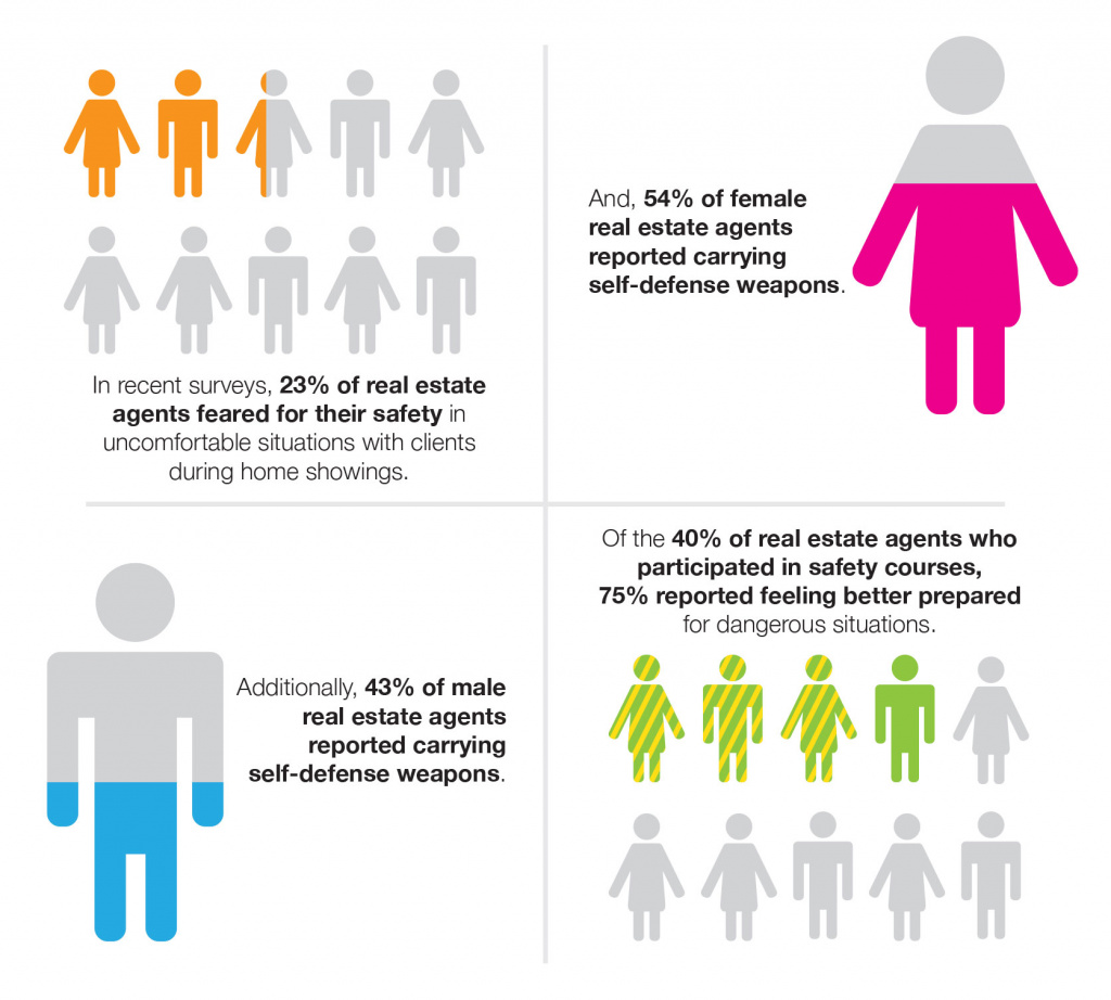
Twenty-three percent of Real Estate agents reported experiencing a situation that made them fear for their personal safety. During open houses, 31% of Realtors reported feeling unsafe in a 2020 report from The National Association of Realtors (NAR).
The use of technology can play a role in the safety of Realtors. Using safety apps and technology has increased in recent years among Real Estate agents. These apps alert and message emergency contacts in the event of an unsafe situation. In addition, they share their location of the agent in real-time. Most real estate agencies work with their local law enforcement agencies to enhance the safety of their agents. Establishing communication channels with law enforcement can be critical in emergency situations.
Goal:
Improve the safety of real estate agents using smart phone technology.
Target User:
• Real Estate Agents, Females 21 – 65 years old; Males 40-65 years old
• Tech-savvy — they are on their phones for several hours a day
• Real Estate agents with many home showings
• Messaging and communicating with friends and family is constant
part of their lives.
Competitors
• Real Safe Agent • V Alert • SafeShowings
Potential Solutions:
• Competitor analysis provided some interesting results and possible solutions:
• Offer a free, non-subscription or low monthly subscription based solution
• Can contact 911 faster than dialing 3 numbers
• Contacts the users “emergency contact list” by text, then phone
• Has real-time location tracking capabilities
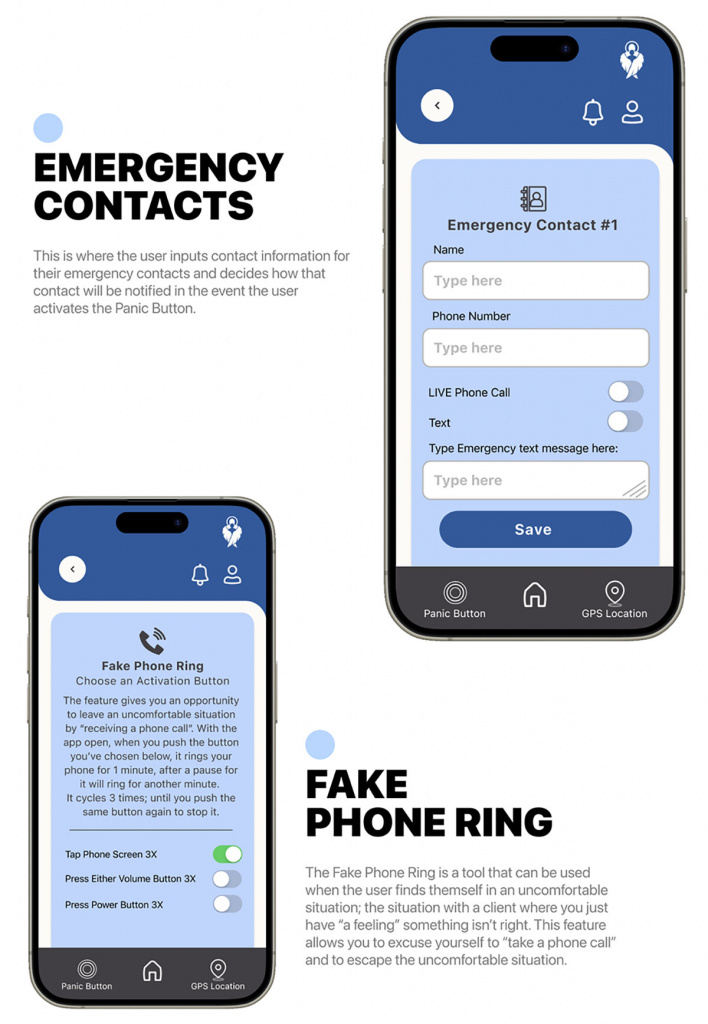
• Has a Panic Button that emits a loud alarm when triggered by the user to also alert the aggressor that emergency contacts/911 has been alerted and that help is on the way
• Has potential for uses in other situations such as single women, joggers, for women on first dates, active seniors, etc.
There appeared to be potential with this concept. Research showed competitors don’t offer for example, a loud siren that could deter and/or prevent an attacker from proceeding with the crime.
PROPOSED SOLUTION
• Make personal security easily available.
• Notify friends, family, colleagues or the police about a threat.
• Educate the user about safety and how defend themselves.
• Deter and/or prevent an attack.
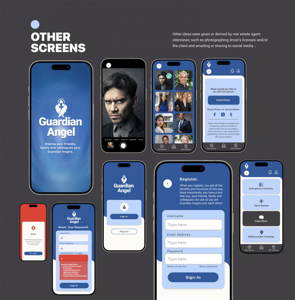
• Real estate client photos of license and/or personal photo can be stored, emailed to others or shared on social media.
USER RESEARCH
Sample of Questions asked of real estate agents:

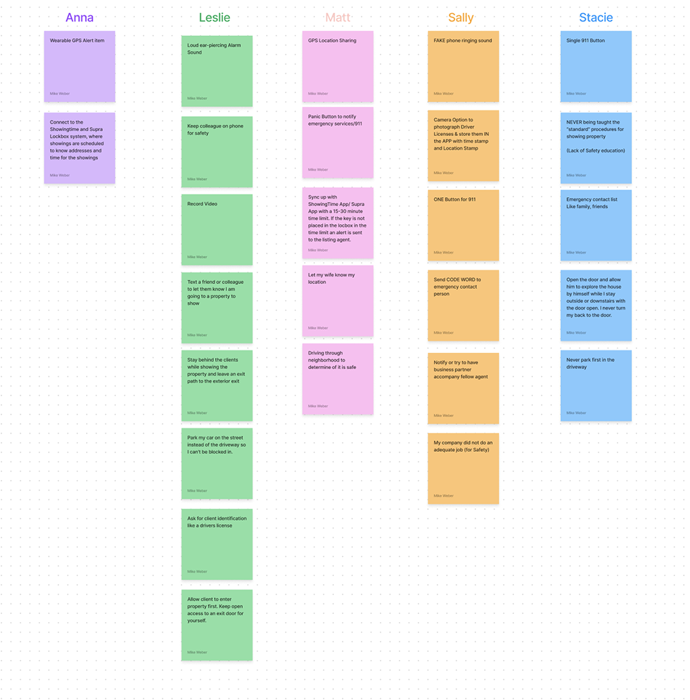
RESEARCH AND INTERVIEWS
The real estate agents who were interviewed had created many different ways to attempt to solve their security problems. They came up with some very creative solutions and suggestions:
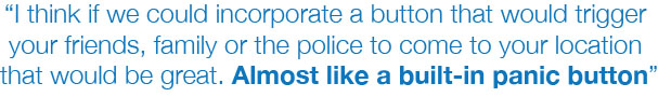
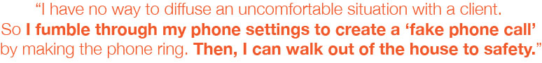

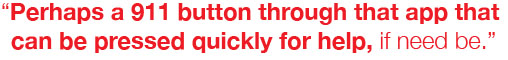
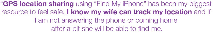
Real Estate Agents were using their phones and other (non-safety oriented) apps to solve their own personal security problems!
DEFINE
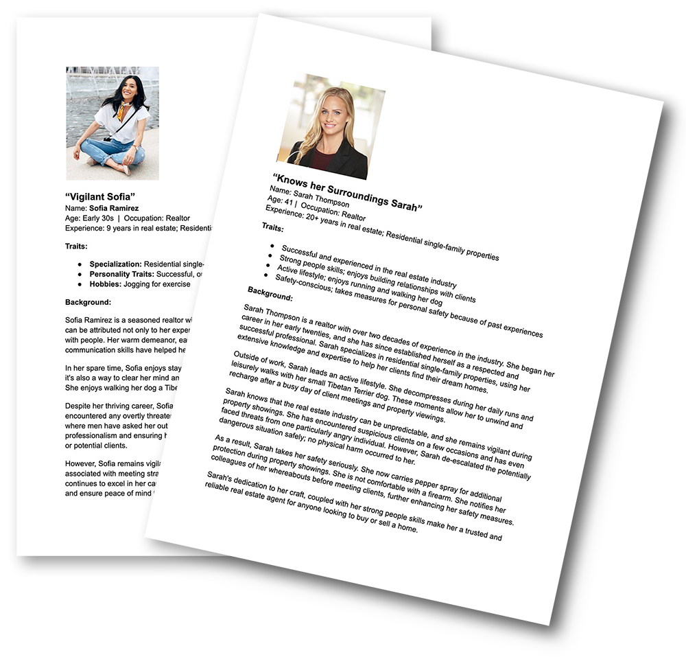
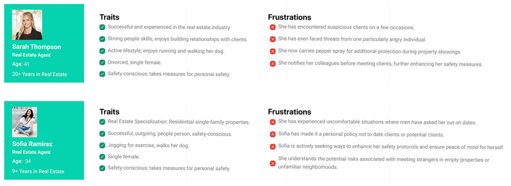
USER PERSONAS
User personas were developed whose goals and characteristics represent the needs of a larger group of users. Usually a persona describes user behavior patterns, goals, skills, attitudes, background info etc.
Sophia and Sarah encapsulated the real estate agents I interviewed. Both personas had experiences and painpoints that the interviewed agents experienced.
AFFINITY MAP
An Affinity Map was developed after interviewing 5 real estate agents. Some very interesting insights and ideas were revealed from the interviews and this process. One of many key insights was that real estate agents were notifying their friends, family and/or co-workers when they were going to be showing a property or when they felt unsafe.
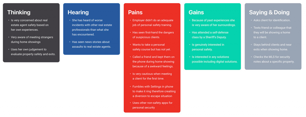
EMPATHY MAP
An Empathy Map was developed as a result of the data gathered from interviews and secondary research.
IDEATION
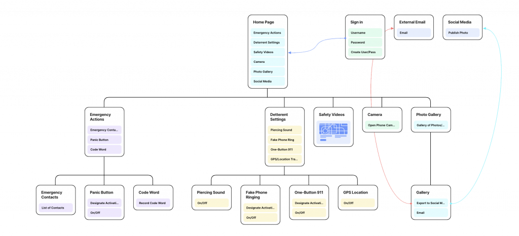
INFORMATION ARCHITECTURE
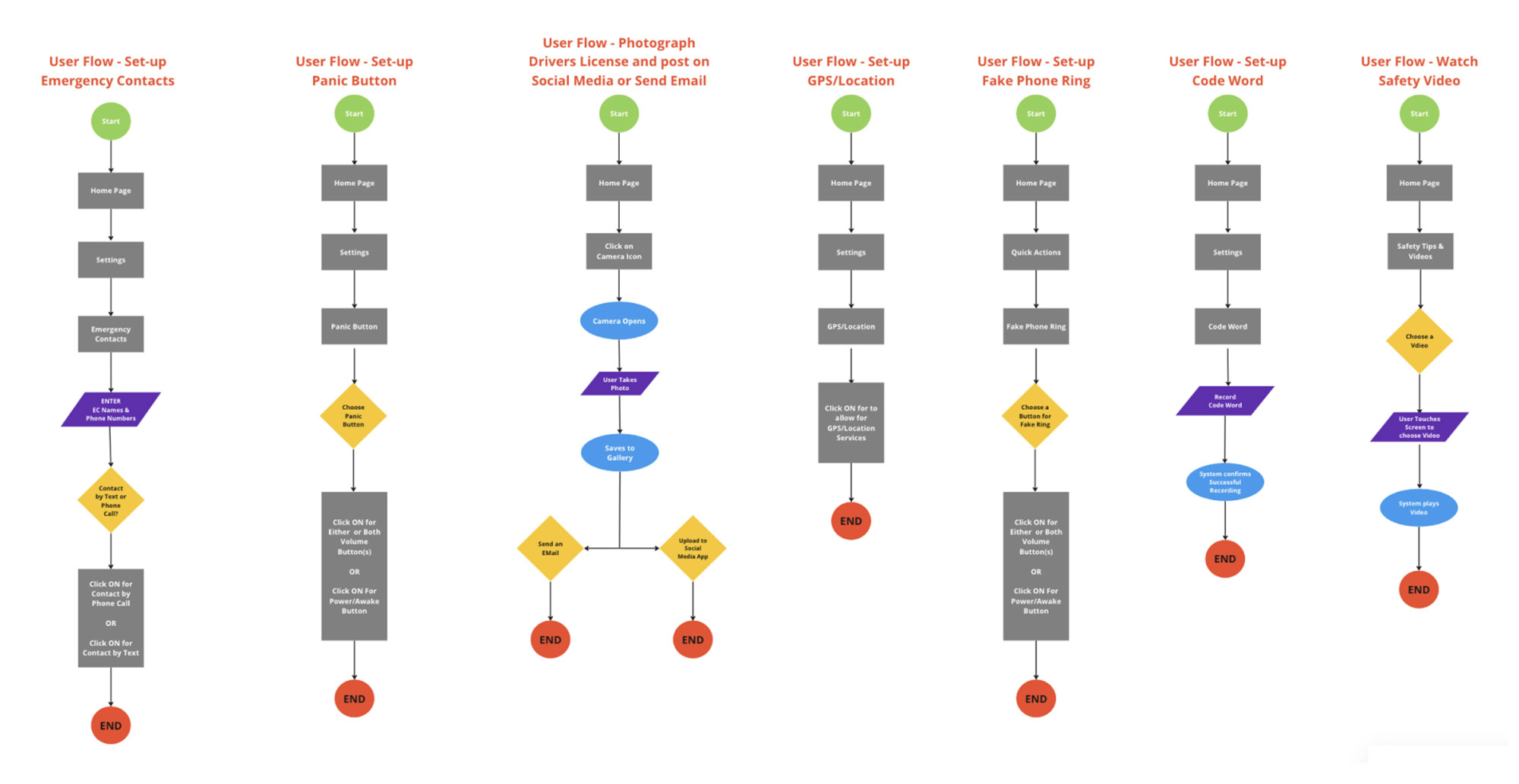
FLOW CHART AND USER FLOW
Below is a sample of user flows that are the visual representation of the steps a user will take to accomplish a goal within a system or application.
SKETCHING
Sketching my red routes to communicate my ideas and working out problems before moving into the designs helped me work out some problems. Below are a few examples.
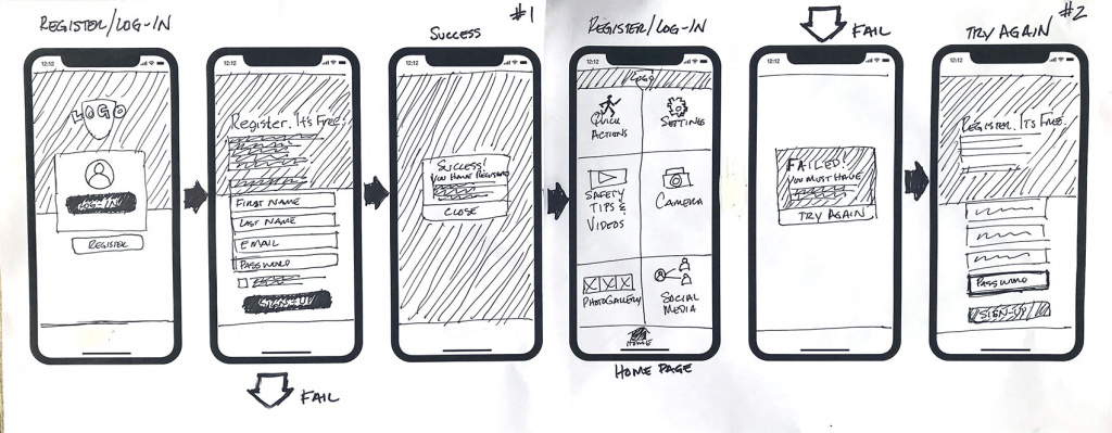
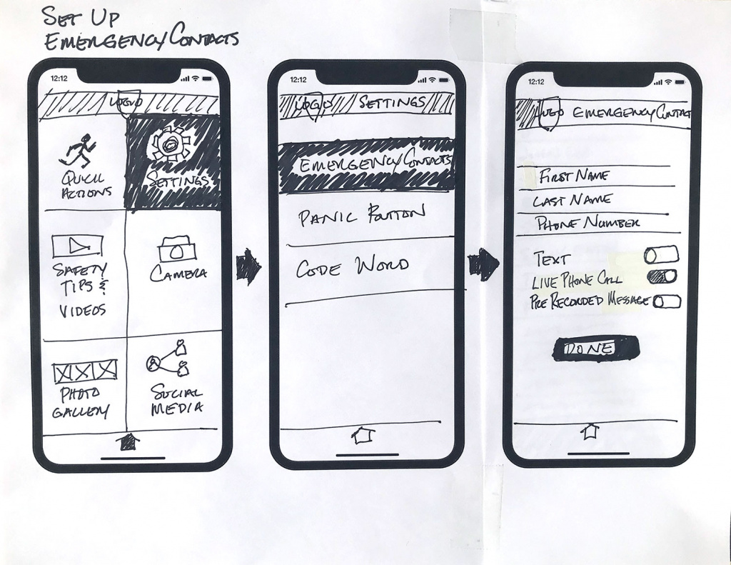
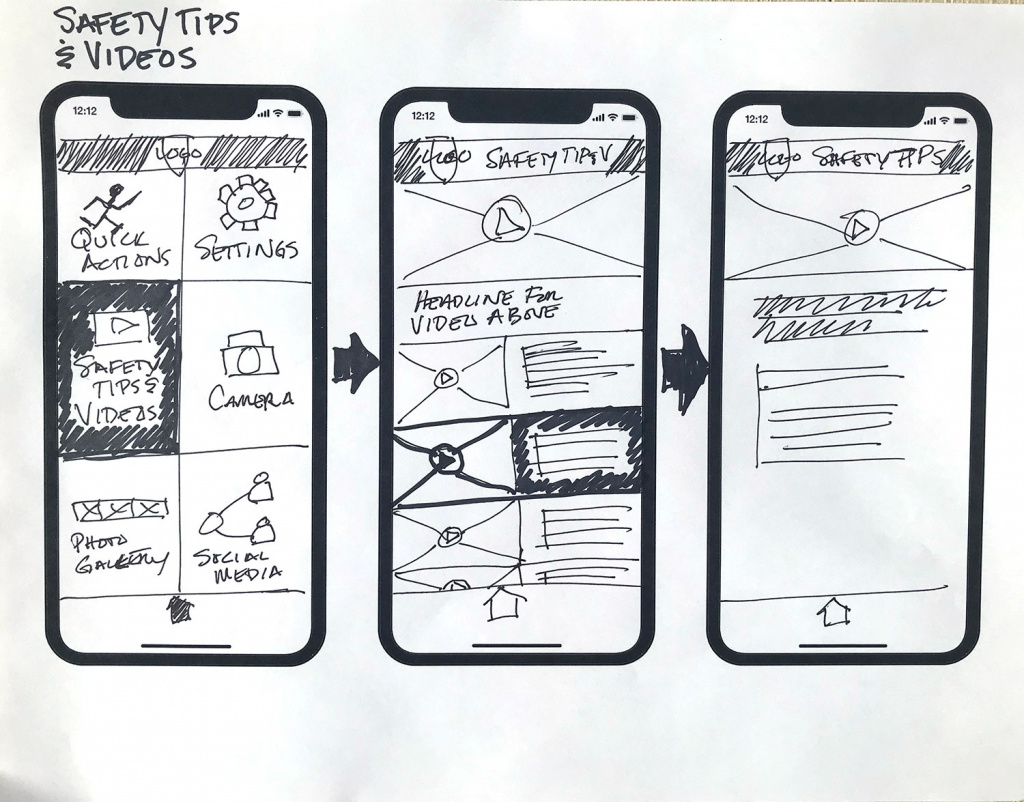
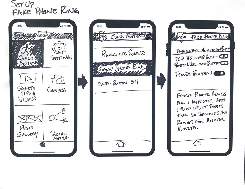
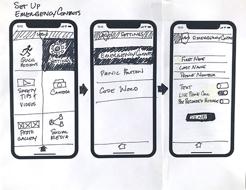
LOW FIDELITY SCREENS
Low fidelity screens were designed based on data from competitor analysis, user interviews, research and sketching. Below are some examples of those screens.
PROTOTYPE
DESIGN SYSTEM
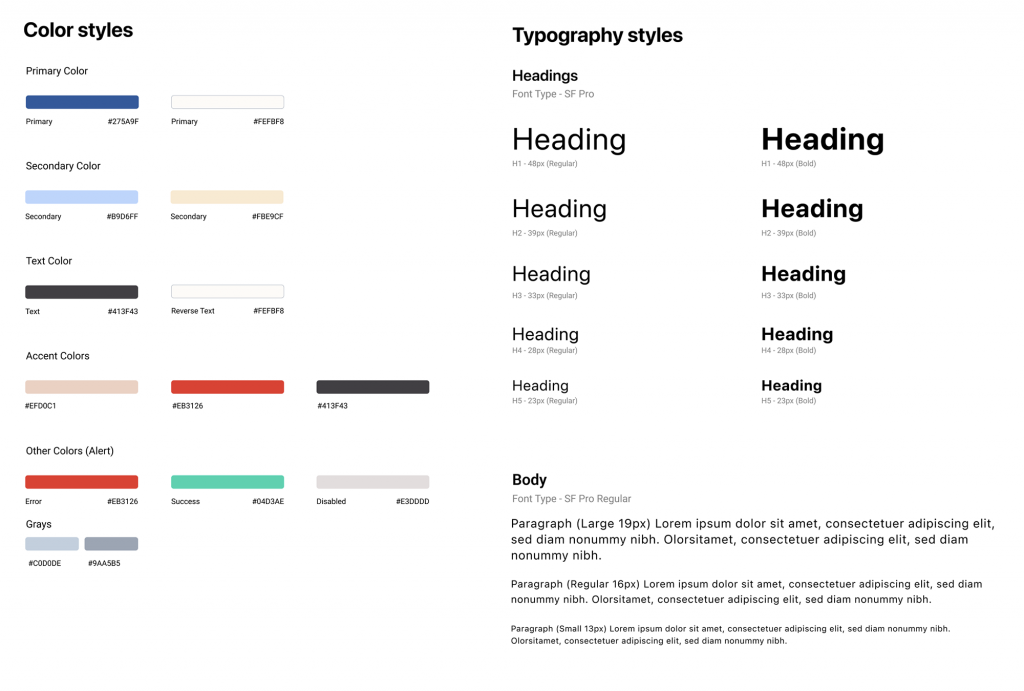
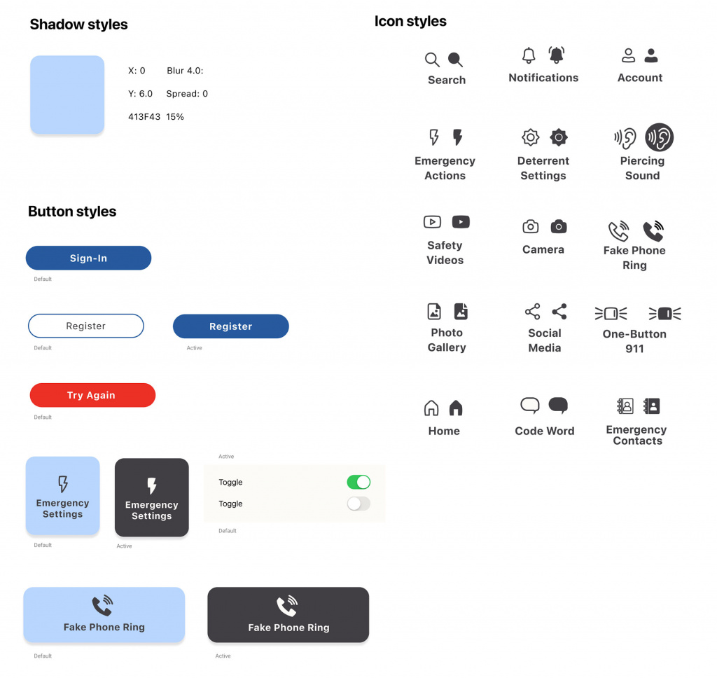
A Design System was created of colors, to fonts, to buttons and icons.
LOGO DESIGN
A name was chosen after some research and a logo was designed to convey to the user the philosophy behind the app and how it works, using friends, family and co-workers as the users guardian angels. The title screen, login screen and home page of the app were designed to show the logo in-use.
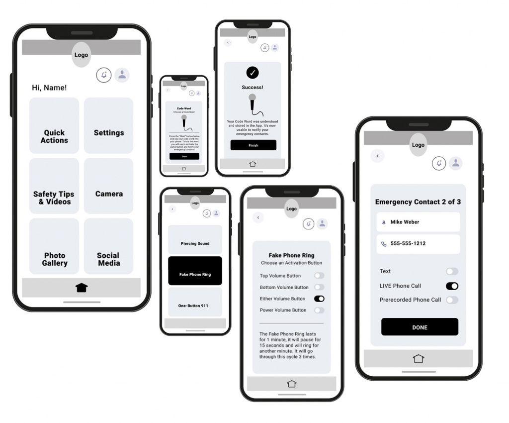
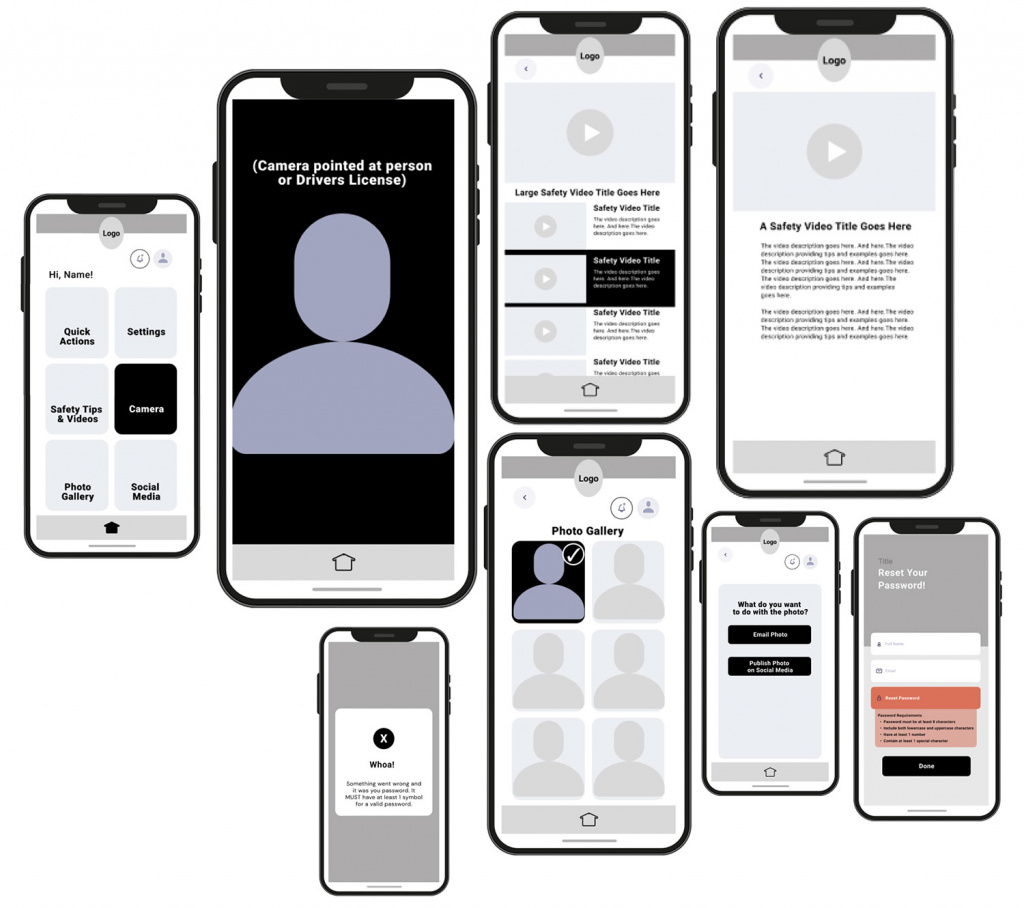
HIGH FIDELITY SCREENS
High fidelity screens were designed. Starting with the home screen.
USER TESTING
Two rounds of usability testing were conducted with 5 test participants each time and some interesting insights were gained.
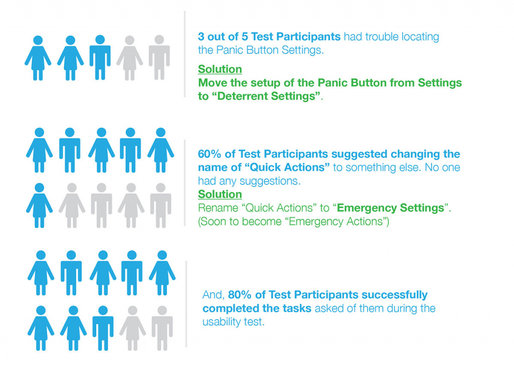
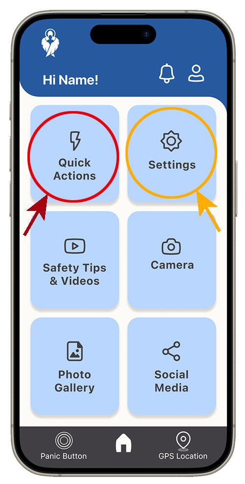
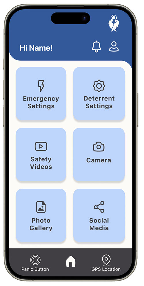
Fixed Problem
Users were confused by the button labels. “Quick Actions” (the red circle) was changed to “Emergency Settings”.
In addition, users were confused by “Settings” (the orange circle) was changed to “Deterrent Settings”.
Usability Test Conclusions:
Renaming/Relabeling Buttons
Users were confused by some of the labeling as demonstrated above. When asked for a suggestion of a new button label most users had no suggestions.
Restructuring the Information Architecture of the App
In the first round of usability tests, test participants thought that the panic button settings were under emergency settings; when they were actually under Deterrent Settings. As a result, during the redesign process, the Panic Button was moved to Emergency Settings as per the usability test participants’ suggestions.
In the second round of usability tests, the opposite occurred. A couple of test participants went to Deterrent Settings looking for the Panic Button Settings when they were actually in the new position of Emergency Settings.
In conclusion, the Panic Button Settings will remain in the emergency settings area because that seems more logical and intuitive since the user would use the Panic Button is an emergency situation. Lastly, the One Button 911 feature will need to be moved to Emergency Settings.
Prototype Link (Click the logo):
VALIDATING THE SOLUTION
Creating this UX/UI Design project was fascinating. Most test participants went through the prototype with no trouble. However, a few test participants did have problems and that is where I gained most of my insights to improve the prototype.
“This is something that is really needed in the (real estate) industry.”
“This would be good for women who are going college.”
“This (the prototype) is easy and user-friendly.”
“I like all of the different safety features. Some are very creative!”
“I’m excited to see what you come up with for a solution!”
“I think this has more use than just for real estate agents.”
CASE STUDY CONCLUSION
The Guardian Angel app has the potential to help not only real estate agents but college-aged women, seniors and more. With features that could the possibility deter an attack, this could save individuals from injury, assault and possibly death.
Creating this UX/UI Design project was both fun and fascinating. Designing the prototype was fascinating because I saw how the answers from the interviews were becoming real tools and real solutions! When the usability testing began, it was interesting to see how users moved through the prototype. Most test participants went through the prototype with no trouble. However, a few test participants did have problems and that is where I gained most of my insights to improve the prototype.