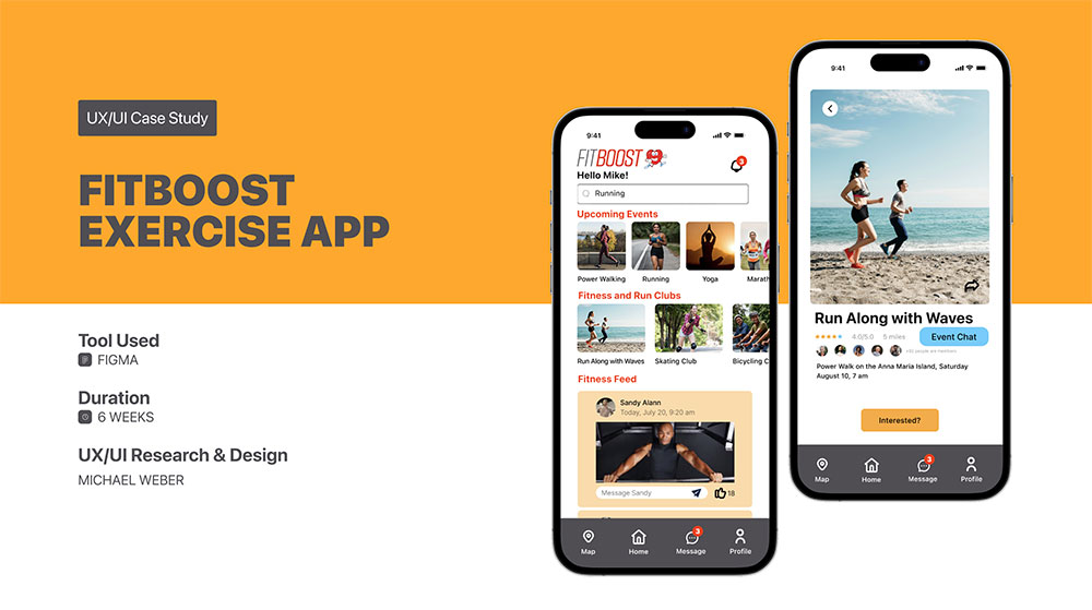
by Michael Weber
PROJECT OVERVIEW
FitBoost, a well-established fitness company launched a family and friends health tracking app three years ago. The app is for both iOS and Android platforms. The app allows users within a group (a family or group of friends) to see how others within the group are doing regarding health, fitness, and their achievements. On average, user engagement is heavy for the first three weeks then it drops off and soon after users delete the app.
Currently, there is no messaging feature within the product. FitBoost would like to integrate messaging into the app and increase user engagement.
Business Challenge
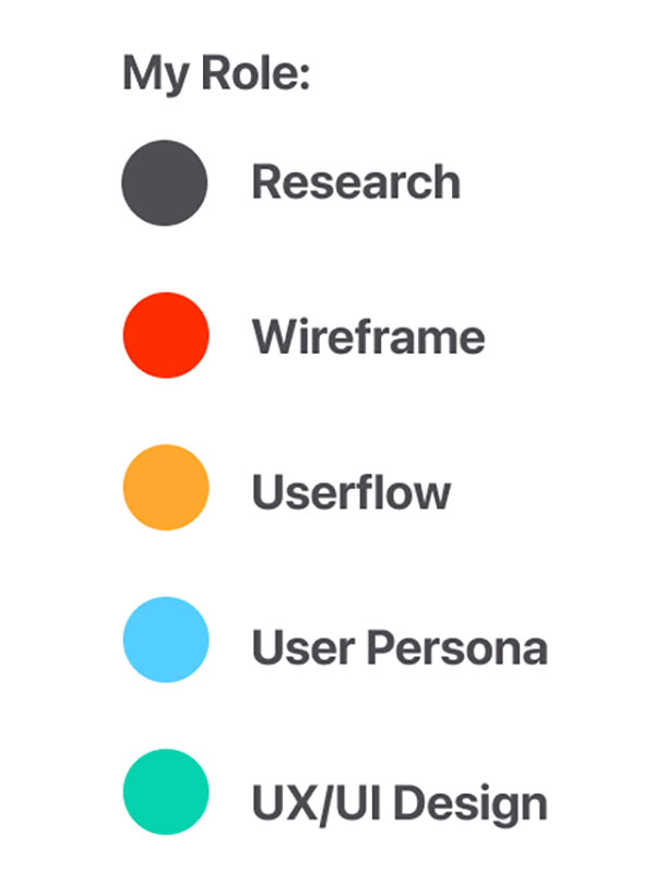
As the UX/UI Designer, I added messaging features to the app to increase user engagement. As a result, the app was no longer deleted from users phones and attendance increased for the fitness events.
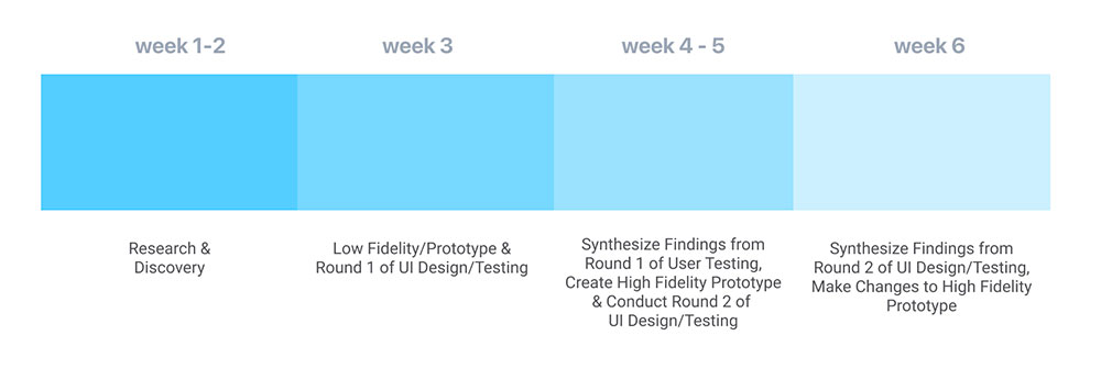
PROJECT DURATION:


PROBLEM STATEMENT – Increase User Engagement
Average user engagement for the FitBoost app is very active for the first 3 weeks. Shortly after, user engagement
declines and users eventually delete the FitBoost app.
My goal was to design new messaging features that create sustained user engagement.
• Create the opportunity for users to message each other with health and fitness goals/achievements and events
• Create an integrated messaging experience throughout the product that drives engagement and repeat usage
Existing wireframes were provided at the beginning of the project.
PROPOSED SOLUTION:
• Create messaging features with individuals and groups
• Create messaging features to increase user engagement of the app by sharing fitness events, goals and personal stats
• By increasing user engagement, users can share fitness events with each other resulting in increased fitness event attendance which in turn builds camaraderie among fitness users which creates more user engagement on the FitBoost app.
How might we help improve user engagement, motivation, and communication?
EMPATHIZE & DEFINE
RESEARCH & DISCOVERY
SECONDARY RESEARCH
Secondary research showed that to elevate the sense of community and accountability users feel within the app’s
activity feeds, chat messaging helps develop a greater connection with the users.
Additionally, secondary research showed that increased communication with customers builds relationships;
resulting in increased business and revenue.
In-App chat feels like an informal form of communication, users resonate with the casual messaging and are more likely to see your message and respond.
Interviews with potential users showed that other people’s accomplishments would help them to do better. For some interviewees, it would become a competition because they would think, “If he can do it, so can I!”.
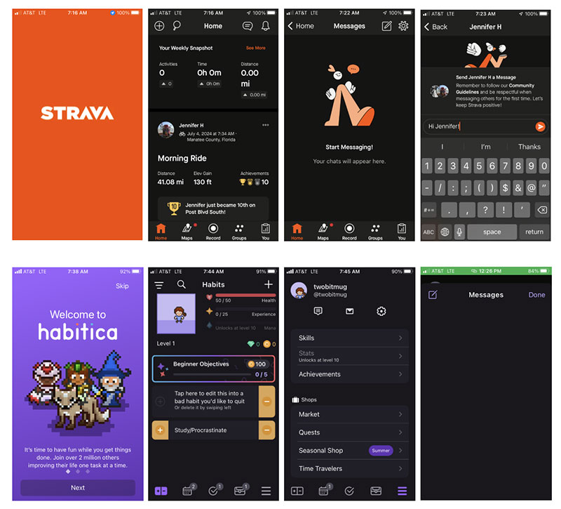
COMPETITOR ANALYSIS
Four apps were studied for there habit forming features and how messaging assisted in that role with users.
Strava, Habitica, Map My Run and Whatsapp were studied for the products target audience, messaging features and any other feature considerations.
Strava is a popular fitness app for runners, walkers and bicyclists. The UI is clean and easy-to-follow. It was easy to locate the messaging feature within the app, the bubble icon.
Habitica is an app that helps users start and stay accountable to start a new habit. Habitica uses an “retro” gamification UI. Locating the messaging feature in this app was difficult because it was hidden in the accounts page. Once the user locates it the bubble icon is apparent.
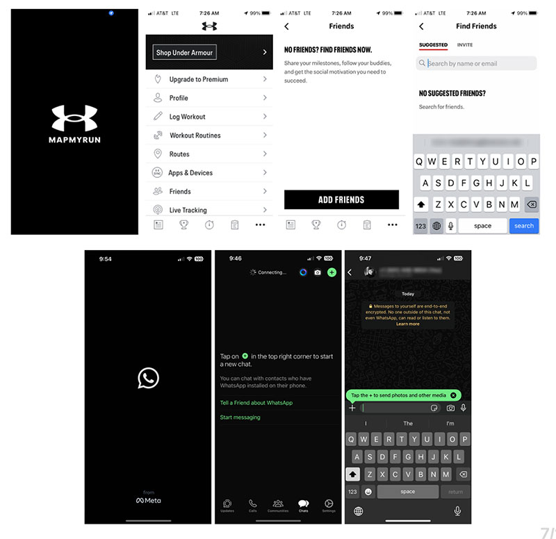
Map My Run is a popular fitness app for people who workout at the gym, runners, walkers and bicyclists, etc. The UI is clean and easy-to-follow. Yet, it was moderately difficult to locate the messaging feature within the app. There is no the bubble icon and the user has to search and guess that tapping the “Friends” menu option allows the user to start a message.
Whatsapp is a popular app for younger users. The ease of this app’s messaging feature is what was primarily studied along with the “Communities” feature since this would be an ideal feature to incorporate into the FitBoost app. The UI for Whatsapp is clean and easy-to-follow .
DEFINE
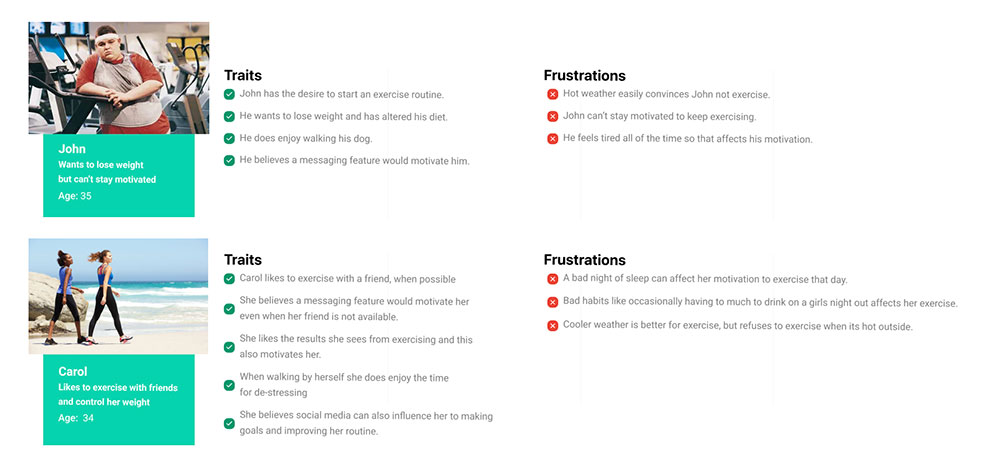
USER PERSONAS
User personas were developed whose goals and characteristics represent the needs of a larger group of users: people who currently have an exercise routine, people who exercise but do not have a regular disciplined routine, and finally people who know they should exercise but can’t get started.
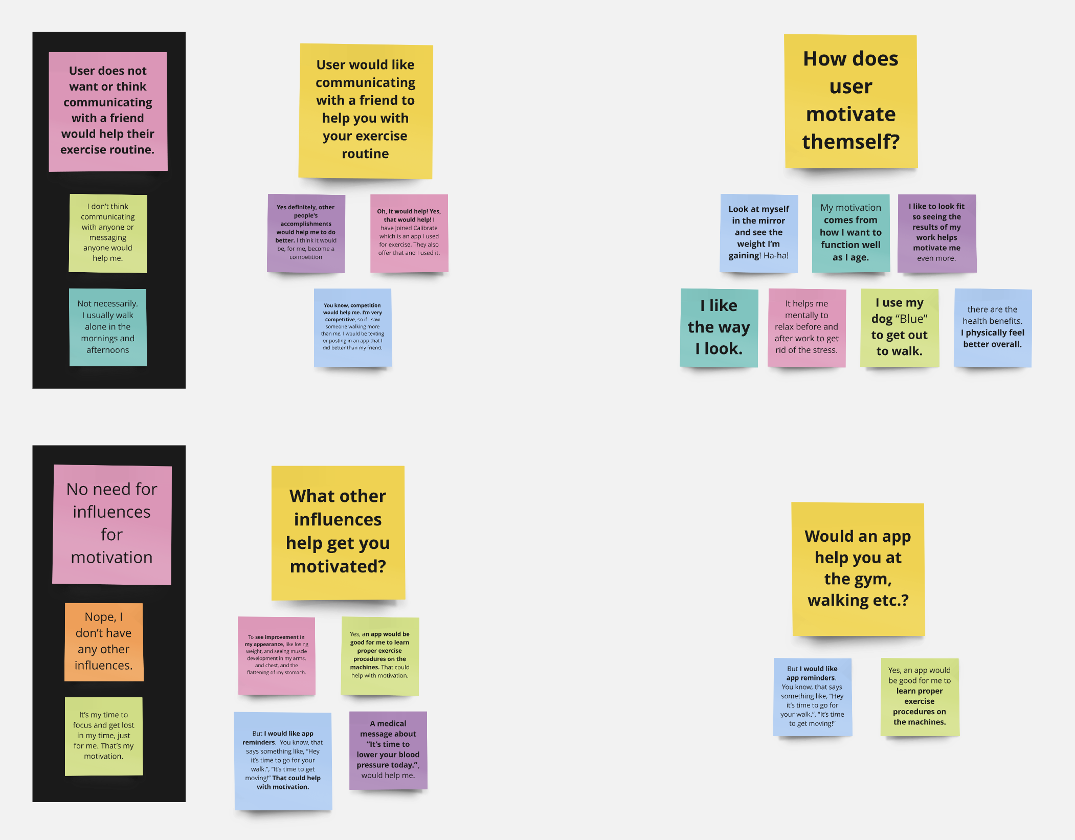
AFFINITY MAP
An affinity map was created after the interviews and it revealed motivations, influences, and a couple of instances where users didn’t need communicating with a friend or needed outside influences for motivation for exercising.
IDEATION
WIREFLOWS
The goal of this project was to integrate a messaging feature and provide a method of sharing accomplishments and goals with friends to assist in user motivation. Below are a few examples of wireflows showing the red routes a user would take to complete a task.
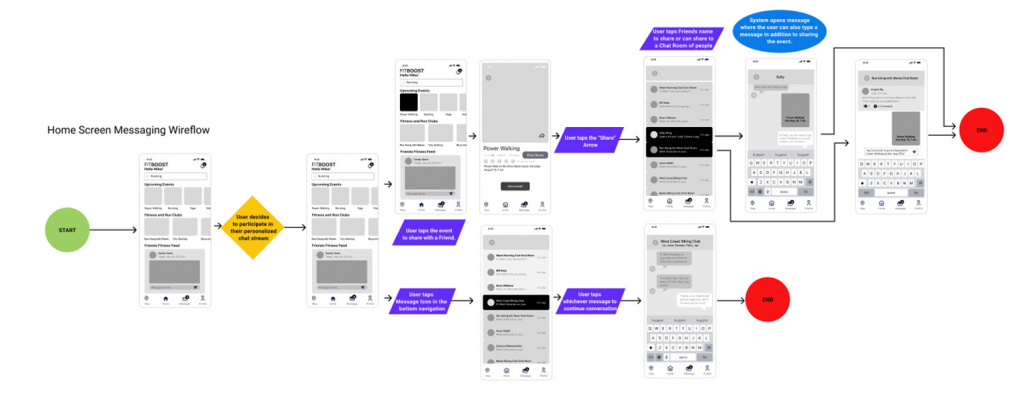
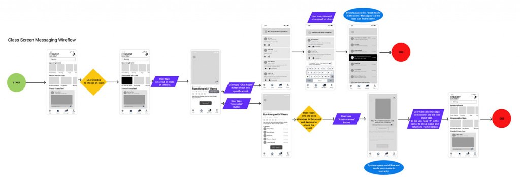
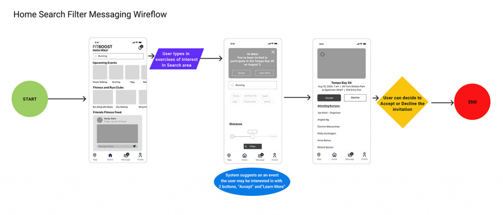
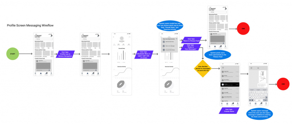
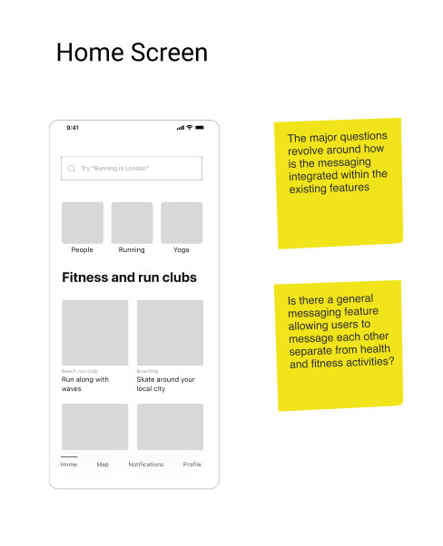
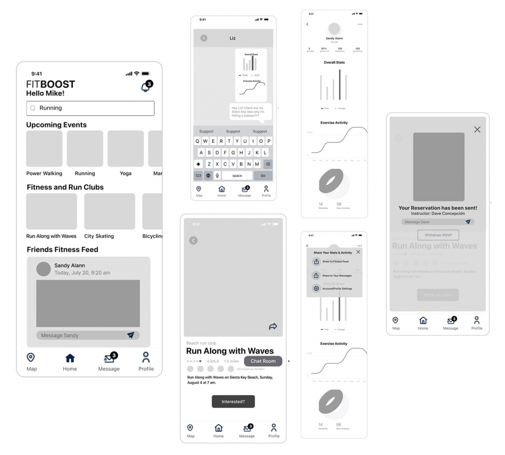
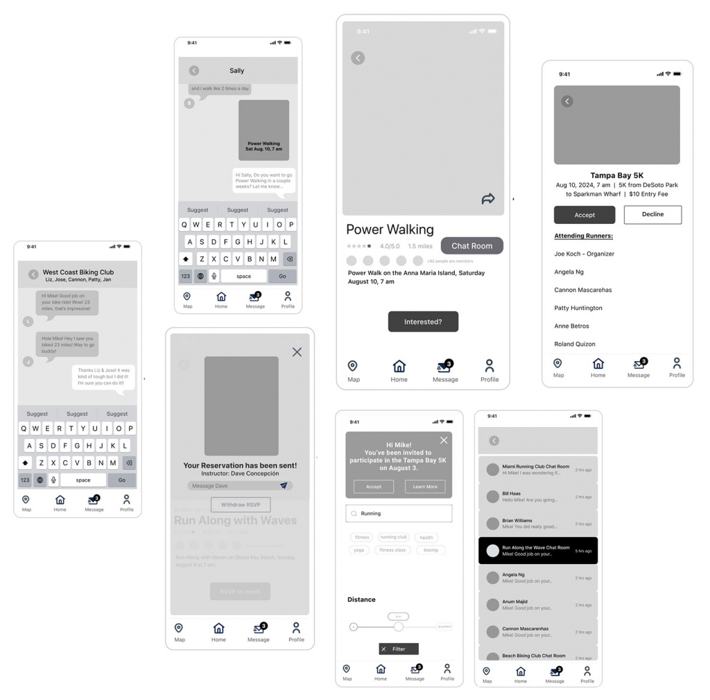
LOW FIDELITY
Low fidelity screens were designed for the wireflows and were based on the wireframes provided at the beginning of the project. Below are some examples of those screens.
PROTOTYPE
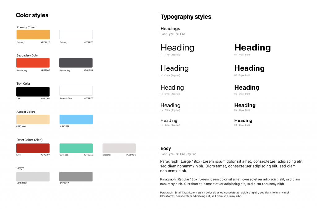
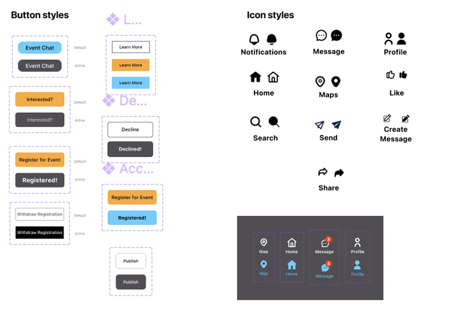
DESIGN SYSTEM
A Design System was created of colors, fonts, buttons and icons.
LOGO DESIGN
A simple typographic logo was designed for the company, FitBoost. A thin, italic font was chosen to convey fitness and movement. A heart character was used on the homepage screen as requested in the project instructions.


HIGH FIDELITY SCREENS
High fidelity screens were designed. Starting with the home screen.
Prototype Link (Click the logo):

VALIDATING THE SOLUTION
I conducted in-person usability tests with 5 participants. User’s feedback validated that the flow and messaging features were useful. Users believed with these messaging features they would help them attend more events and increase motivation.
Users stated they said they liked the “Event Chat”.
Users commented that they liked the “Event Chat” button and group chat area, accessible by a button, to chat with other fitness attendees of a specific event. Users mentioned that this would motivate them to attend an event by seeing who is going and by asking questions to the entire group.
“I like the suggestions made by the app”
3 of 5 users commented they liked the suggestions made by the app based on the filter search. They found it to be a helpful feature that would lead them to registering for an event.
Users responded well to sharing fitness events to group messaging
Users liked liked sharing fitness events with each other. They thought that would help the achieve their fitness goals because most users want a “fitness buddy”.
“It was easy to find the messaging features in the app”
All 5 test participants commented that they found the messaging features throughout the app easily, understood them and found them easy to use for sharing and messaging.
“I think this type of app (with all of the messaging features) would help me!”
80% of users said they thought the app with all of the messaging features would help motivate them and get them to attend fitness events because of the number of events and because they can chat with other fitness users.
CASE STUDY CONCLUSION
The average user for the FitBoost app had active user engagement the first three weeks. Soon after, user engagement drops off and users delete the app.
At a the start of this project, there were no messaging features within the product. I integrated messaging into the app to increase user engagement. The features added were:
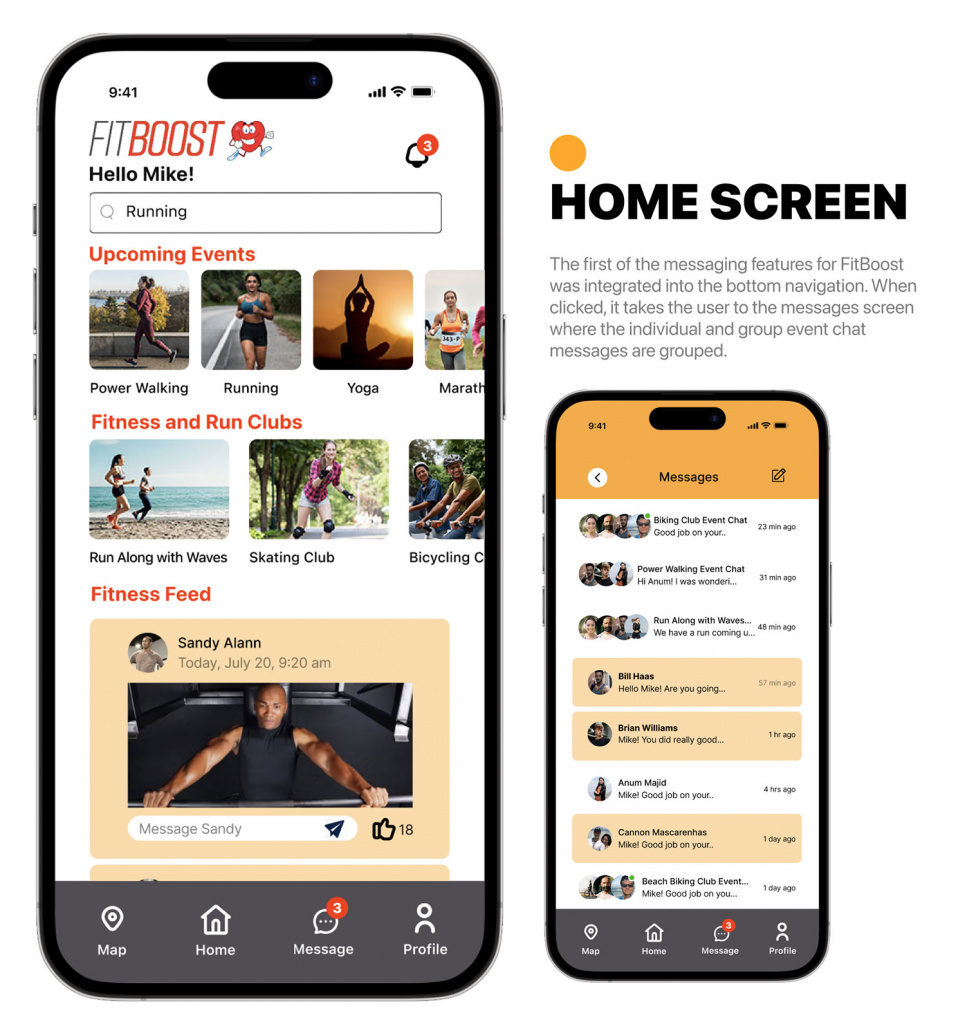
• Messaging was added to the bottom navigation so it appears on every page of the app.
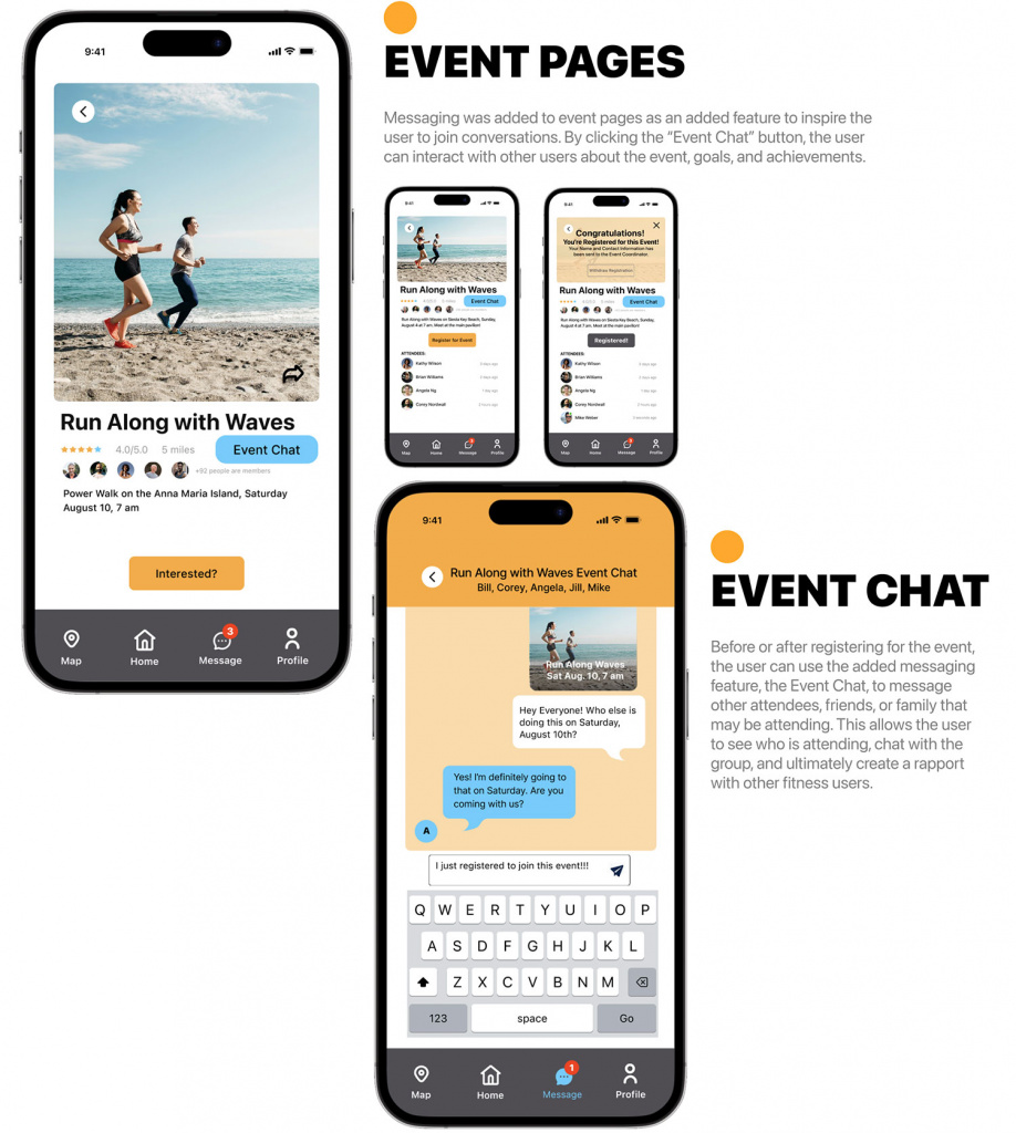
• Messaging and sharing features were added to all fitness classes and fitness events.
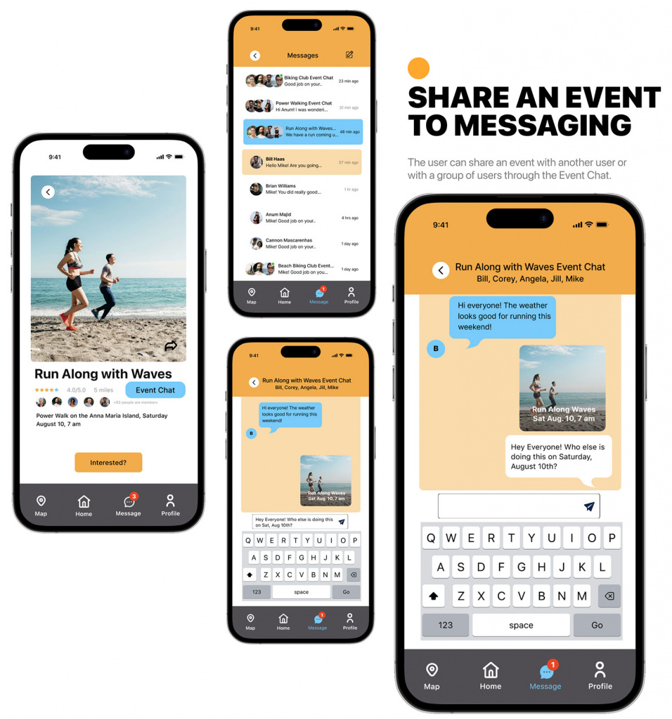
• Registering for a fitness classes was made easier as was sharing a fitness class with a single user or a group of users.
• An “Event Chat” (a group chat) was added to fitness events so potential attendees could chat with other participants to ask questions or receive encouragement to attend a fitness event like a 5K race, a beach walk, or bicycling event, etc.
• The search filter offers suggestions to the user. The user can share their registration of the class to other users to encourage them to join them in a class or fitness event.
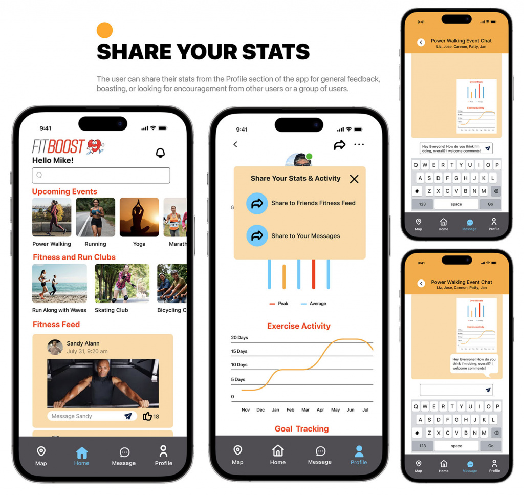
• Users now have the opportunity to share their exercise stats with other users or groups of users for feedback or encouragement.